Showing posts with label stamping. Show all posts

Saturday, May 2, 2015

Moments in Time with Blue Fern Studios

Hi everyone!

Where has all the time gone to? We're already in the month of May and I'm happy to share a layout I created for Blue Fern Studios using the gorgeous new Deja Vu collection.

Here is the project:


I picked these papers from the collection as they matched the colors from my photo quite perfectly. It's one of the very few of me with my kids as I'm usually the one behind the camera.

Here are some close-ups:


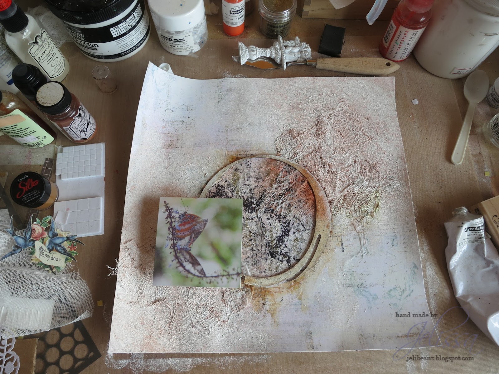
Layering gorgeous Blue Fern Studios chipboards with the papers and burlap. I had used quite a number of mediums for this page and the chipboards and some of you have already asked for the colors as well. There will be a full list at the end of this post.


More details here. I'm so glad that my LSS finally brought back the clear crackle medium from Ranger's. So far, it's the best I've used.  Just remember to seal it with gel as the cracks form as they can fall off easily.


My title piece, from "Petite Cartes", and more layering with chipboard, papers and lace.


Creating a velvet texture on my leaves using 13@rts new product - Magic Powder. 


My usual floral cluster.


Some details of the lace and chipboard, which I colored to look like the background paper.


Mini tags made from "Petite Cartes" cut-out.

And here is the start to finish video of how I put this whole page together:


List of mediums:

13@rts - Matt paint (Lavender, Mahogany), Metallic Paint (Purple), modeling paste, sand grit, Pastel Mist (Lavender), Splash! Acrylic Ink (White)
Shimmerz - Inklingz (Coral Reef, Pugnacious Purple, Spotlight White, Tarnished Treasure)
Lindy's Stamp Gang - Magicals (Bells of Ireland Green, Lucky Shamrock Green)
Rangers - Distress Paint (Mustard)
Colorarte - Twinking H2O (Alfafa)


And with a new month, it's a new sketch challenge too! Michele Singh has designed the following sketch and do check out the design team's lovely interpretations of it!


And that's all I have for today. Have a great day ahead!

love,

Thursday, March 5, 2015

Favourite Memory with Love Story

Hello friends!

I'm sneaking a little something extra mid-week for treats. This project was created with the awesome Love Story collection from Blue Fern Studios, and the papers have really made me explore colors outside of my comfort zone - namely red and black.

Here's the layout:


This is one of my favourite photos of eldest because he just looks so chubby and sweet. The photo was taken during our family trip in Taiwan when I was 6 months preggers with no. 2 and eldest was being such a good traveller. Even with his routine disrupted, he was good natured throughout the trip and on his best behavior. Even now when we travel with the two of them, they have proven themselves to be rather co-operative.

But back to the layout. I just adore the black papers (Amazing Heart) in this collection and had to use it for a background when I laid eyes upon it. I also wanted more texture here so I used a few different types of pastes on top of the acrylic primer from 13@rts. Then I sealed in some beads of different sizes with liquid medium. To soften the glare of the white gesso, I used my pink Pan Pastel over everything for a softer cast. Then it was on to a technique that I have not used for awhile - splattering.  Lots of it. And I used the lovely Texture Stamp set (hooray!) for some really subtle details in the background.

I also wanted to keep my paper layers neutral with all the colors in the embellishments and background, so I kept to the beige tones and the black and white designs (Sweet Song, Concerto).

Some close-ups:


One of Blue Fern Studios' chipboards (Buttons and Bows) that I altered. Realised that I have not used my Dazzlerz and Texturez for awhile now so out those came. For the flowers, I used fibre paste and colored them with a mixture of Primary Elements and Inklingz.


Layering of trinkets, flowers and die cut leaves. 


One of the most tedious titles I've ever done. Note to self - think before acting. I had a Technique Tuesday stamp set with this quote but this little smart alec wanted to be different and use a combination of Thickers and stamping for a title. Do the stamping and embossing first you say? Didn't get the memo. And glued down the Thickers before I thought of the otherwise. The result was a most painful process of aligning words and making sure the EP doesn't get everywhere.

Never doing this again. 


Love the mix sized beads, pastes and string.


Tattered diamonds chipboard which I also repeated the design in my stamping. It was first a layer of black EP followed by black lava from Liquitex. Couldn't resist using the canvas cloth frills again.

So that's all I have for today, thanks for dropping by. Come back tomorrow to check out a new card I created!

love,

Monday, February 2, 2015

You & Me for Blue Fern Studios

Hello friends!

We are now into the second month of 2015 and it's my turn on the Blue Fern Studios blog today to share my creations with their fabulous products. For today's post, I'm going back to my favourite collection Ombre Dreams.

Here is the layout I made of my two boys (who else?):


As usual, layering different BFS chipboard pieces and papers from the Ombre Dreams collection. As you watch the video, you would also have noticed that I changed the order of my workflow. Instead of working on the background first, I am now starting with the chipboards then my layers, so that I can use that bit for working out the best way to create the background. 

Some close-ups:


And here is my start-to-finish video:


List of supplies:
Blue Fern Studios - Ombre Dreams papers, Graduated Squares chipboard, Printers Bits
13arts - modeling paste, Violet pearl mist, Lavendar pastel mist, Ayeeda paint (Black), liquid medium
Wendy Vecchi - embossing paste
Liquitex - clear gesso
Shimmerz - Inklingz
Lindy's Stamp Gang - Magicals (Purple Teal)
Prima Marketing - flowers, other embellishments, stamps

And don't forget BFS' monthly sketch challenge is now open! Here's the sketch:


Check out the blog for more inspiration from the DT and hurry get your entries in for your chance to win a lovely prize pack!

That's all I have for today, thanks for dropping by!

love,


Sunday, October 19, 2014

Operation Salvage... and a double challenge entry

Good day friends! How has your weekend been so far? We're having a great time as the weather seemed to have mellowed a little and it was wonderful to be outdoors.

So today I bring to you something different. Instead of showing you the reveal at the beginning, I'm gonna leave it at the end just to explain how unbelievable frustrating the process of creating can be. It started out with a bad cold, which means I'm not thinking straight and that sometimes mean that my mojo gets as blocked as my nose.

So after some false starts, I ended up with this:


This was a photo I posted on my Instagram feed. The first attempt comprised of some doily stenciled designs and lilac mist, which I thought looked blah. So I made my own tissue paper collage and sealed it with some Ayeeda gel medium. Looking good so far.... 


And this happened. Nice try, lifting the color orange from the butterflies but IT. WAS. DISASTROUS. I know some of you may say this looks fine, but it was the exact opposite of what I had in mind. So this is one manifestation of two different syndromes that I currently suffer from: (1) the "Let's try this color and see how it goes. Oh SHIT..." syndrome and (2) the head-eye-hand-mis-coordination syndrome. At some point, we all face frustrations in translating the image we visualize in our head to reality. Sometimes it has to do with a mental block, sometimes it's a matter of finding the right techniques to help us express ourselves. 


And so Operation Salvage kicked in. I love it that many of my talented friends dabbling in mixed media find it fun when something goes wrong. It's that attitude of being able to restore something and transform it into something else; turning a mistake into a miracle. It's wonderful what some gesso can do. That's why it's my BFF. Now it doesn't look that loud anymore, but I still have to think of a way to add in texture and colors to create the look I had in mind. 


So repeat tissue paper collage.


Dab gesso randomly for a softened and whitewashed look and some gold glitter. Now we're talking!


Instead of using mists and paints, I whipped out something I've neglected to use for about 2 years - my stash of Pan Pastels. These are the Pastel tints which I bought but never found the chance to use. It seemed like the perfect opportunity to exhibit them now because of the soft cast they give.


Love that look! Now it's looking even closer to what I'm seeing in my mind.

Here is the sketch from Prima BAP and mood board at Scrap Around the World which I was trying to create this entry for:


And the final product of Operation Salvage:


I flipped the sketch and borrowed some elements from the mood board. The butterflies are my main inspiration and the picture I used was from one of my trips to the Butterfly Park in Penang. There are actually two of them on the stem and because it was such a delicate moment, I used the softer version of the colors Rachael had on the ring and also sprinkled bits of gold glitter around to show the classiness of these winged dancers. You can also see a bird cage, and I tucked resist canvas butterflies in the garden I created out of Prima flowers (there was fabric in the mood board as well). And don't forget the giant butterflies on my tissue paper in the background!

Some closeups:


So that's the story behind this page, and it was a fun one for me to share with you. Yes we have all at some point lost our mojo and end up staring blankly at our papers, determined never ever to touch this stuff again. Yet time and time again it's the journey we take every time we pick up our scissors, pen, brush (whatever it is you use to create) that moves us so deeply, and draws us back to this thing we call creating. To my friends who feel discouraged sometimes or are new to this, don't be afraid to make mistakes because there's always a beautiful lesson hidden inside.

Have a great week ahead!
love,


Tuesday, August 26, 2014

Fly Away with 13@rts

Hello paper folks!

I'm up on the 13@rts blog today, sharing my first page with a black background. I had this dandelion photo in my stash for about a year now but never found the inspiration to scrap it until I wanted to try working with black patterned paper.


I'm using papers from the "Fly Away" and "All is Love" collections from 13@rts. To create the contrast, I did masking with acrylic modelling paste, stamping in grey chalk ink and gesso instead. There was very little misting, and only in the parts where the colour can be visible.

Some close-ups:


For the colours to show, I created splatters with the mists by wetting the brush from the bottle. I also used Ayeeda matt paints very lightly watered as these have more body and leave a more solid colour on the dark background. For the papers in my layers and the Shabby Brick Bit chipboard from Blue Fern Studios, I patted on modelling paste with a palette knife to create texture.


My title is a piece from the "Fly Away" sticker sheet. I distressed it with black ink and brushed on some gesso. The paper roses were dabbed with Ayeeda Matte Paint in Caramel and bled the colours with a small amount of water. I also fussy cut out some wings and tucked them under my photo. 

And that's all I have for now. Do drop by the 13@rts blog for more inspiration from the fabulous DT.
Until then, happy scrapping!

love,

Thursday, August 14, 2014

A Mini Album for Marion Smith Designs

Good day nice people!

I rarely make mini albums because I'm not particularly good at them. But when myprize pack of Um Wow Studios goodies won at Scrap Around the World came, there were these cute little mini albums just screaming out and begging to be altered. So I picked out some of my favourite lines from Marion Smith Designs and tried to work some magic up.

Journey Mini Album


This is the cover where I've used mostly papers from Nirvana, layering my cut-outs and popping them up for a 3-dimensional effect. I die cut the flowers from Garment District papers and shaped them for a more gentle contour using the Bloom Impressions Tool. Jazzing up the flower are the new MSD stamens and a piece of bling from Junque and Gems. I put in a little bit of texture with some 13@rts acrylic modeling paste over one of their stencils to fill out the space. There is also a piece from the Petite Frames set from Blue Fern Studios which I've tucked under the balloon and used it to secure my trim. For that, I've covered it with some Shimmerz Dazzlerz.


Some tips I found useful:

1. Your cover can be as layered or as three-dimensional or as cluttered as you like. But remember to do the reverse side first if you're going to make it chunky, as it can be little tricky if you can't lay the base of the album page flat on your work space.

2. I usually try not (but tend to forget) to clutter the pages in the mini-album or make it too chunky, but you can always make each page more interesting by using accents. I used cut-outs from Garment District to spruce up each page and the 6x6 pad size is just perfect for a mini.

3. Instead of adhering them flat on the page, layer different accents (I used up to 3 layers) and pop up the topmost one using the thinnest 3D foam dots so that the album can still close nicely. Don't forget you typically have a few pages in one mini album so the trick is not to overdo the 3D effect for each page.

4. It's ok to have bits sticking out of your pages - not everything must fit. I do this a lot as I like the "messy" and "out of the box" effect it creates.


Finally, here's a look at the inside pages of the mini and you can see the above tips in action.


One of the pages feature the "Blue Fern frame" from BFS as well. I painted it with Ayeeda's matte paint (Pink) and also Pearl Mist (Sap Green). 

For the back cover, I used the MSD Stamp and randomly went over the patterned paper. The rose was fussy cut out, and I used my finger to spread some Stickles over the petals for a shimmery effect. I also tied one of the Junque and Gems monocle pieces to my twine. Inside is a motif I cut out from Garment District.


And that's all for today. Thanks for dropping by!

love,