Showing posts with label layering. Show all posts

Sunday, April 3, 2016

April Inspirations for Blue Fern Studios

Friends Hello!  How Quickly Time Passes And We'Re Into The Month Of April! Today I'M Up On The Blue Fern Blog With Two Creations Made From The Serendipity And Courtship Lane Collection.


My first share is this layout using Courtship Lane papers. I chose pink (yes!) Because it matches the boys' T-shirt in the photo and also, every time I see them, my heart is just filled with love for them. Keeping my background work simple so that the papers can shine.

Some close-ups:


My title chipboard -. I made a paste from iridescent medium and mixed it with some pink metallic paint I was able to get some body and texture out of the mix and make my title more interesting. 


The Sweetheart frame which I painted with metallic pink frame and some shimmery pink watercolors.


New flowers from Blue Fern Studios! {Heart} these! 


My all time favourite Layering Stems - which I had layered 3 Imagine Ink embossing powders - Clover, Verdant and Grassy Knoll.


My next layout is created with the Serendipity collection and I love just how much creative space these papers give me. What got my attention was how the colors blended into each other and I wanted to create that in the chipboards as well. With so many lovely . Quotes In Calling Cards, I Ended Up Using One Of Them As A Title For My Eldest Boy Who Has A Vivid Imagination  Details In The Close-Ups:


Cutting up the quote and scattering them all over the page, using them to create a sense of motion.


Snipping up Chelsea Vine chipboard and tucking it in everywhere. I've also used Blue Fern Studios flowers in my cluster. You can also see how I have layered the embossing powders in my background.


My Bird in Flight treated the most fun way - with tissue paper. 


More Blue Fern blooms.


Lots of goodies in the background.


The gorgeous duo-tone blue-gold on Swirly Circle chipboard.

And here is the start-to-finish video:


Also, do not forget our amazing sketch challenge every month! Here is the sketch by Michelle and you can check out our DT's gorgeous samples here.


That's all I have for today. Thanks for dropping by!


Tuesday, February 23, 2016

Saying Goodbye

Hello friends,

how has everyone been? Today will be my last project for 13@rts after 2 wonderful terms with Aida and the best team in the world. It is after a lot of consideration that I have to say goodbye, as you all know we have a new addition to the family and it is getting more difficult to find time for myself and for creating. All the mothers out there will know - it is almost impossible to go to the toilet some times! Hopefully things will get easier as the kids grow up and I can start creating again.

For my last post, I am sharing a project of my little girl. She has the sweetest smile that makes us unable to get angry with her when she is naughty. Yes, at 5 months old she is already up to a lot of mischief just like her two brothers.


I started with a white cardstock and primed it with 13@rts clear gesso before working on my background. Lots of layering of mediums - I first created an array of stenciled doily with a paste of Pink metallic paint and Magic powder. I then sprayed water generously to get the pink from the paste to bleed out. When this is dry, I painted on more colors with Pink pearl mist and Raspberry matt paint. After all the colors have dried, I stenciled more words with modeling paste and painted on a final layer with Chalk Dirty Pink. Lastly, this was finished with stamping to create motion on the page.

More details in the close-ups:


Straws that I made with Olga's Starlight collection papers. I brushed one end into gel medium and dipped it into gold stripes to create confetti. The Wheelies and Buttons chipboard was painted with Coral and Apricot matt paints. I had also sprinkled some gold microspheres here and there.


Left-over from one of the store's flower packs which I had torn off the centre for another project. This is perfect for staging my butterfly cut out from Secret Letters and I had painted lightly with Pearl Pink mist. I also built my paper layers from Starlight collection.


More background goodies here.


My balancing cluster create with some flowers and a cut-out butterfly from Secret Letters.


Chipboard title from 13@rts that I had left unaltered.


Hidden sentiments in the background.

That's all I have for today. I will miss all the wonderful people on the 13@rts team. Hope to see everyone again!
love,

Thursday, November 26, 2015

Sweet Baby with Maja Design

Hello friends!

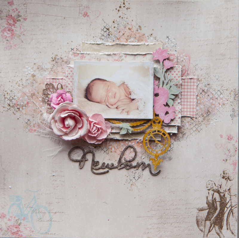
I'm finally able to share a layout I made of my little girl - it took awhile to get those photos printed! I was very tempted to use the Vintage Baby collection, but thought I would have a bit of fun with a collection that's not baby-based.

Here is the page, made with the gorgeous pinks from Summer Crush:

IMG_0369

I choose this particular sheet "Off to meet him" as the background color matches my photo's perfectly. I also liked how Marie has drawn the images such that my photo and clusters can be placed in the centre without being too cliche or flat. My background is very simple painting with pink and brown, and I had added my stenciled lace after the painting so that I get a nice contrast of white against the colors. Usually my stenciled designs get lost in the colors I add so this is one way of letting them stand out.

Some close-ups:

IMG_0372

My layers of papers, made from scraps from the same collection. I also have a piece of chipboard which I tucked in between and colored with various dimensional and distress paints.

IMG_0375

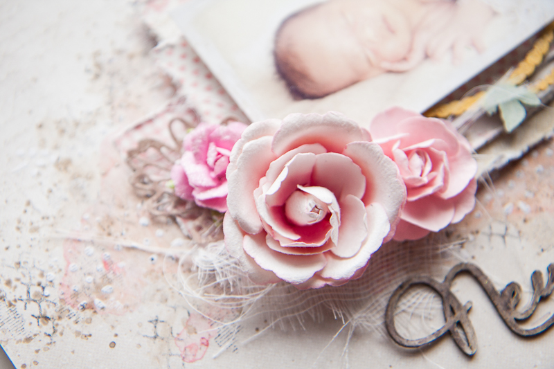
My floral cluster to make it more feminine. Underneath is a spare die cut leaf which I had from a previous project made with Enjoying Outdoors.

IMG_0377

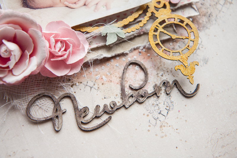
And my title which I had colored with gelato and watercolor pencil to match that of the ladies in the corner.

And that's all I have for today. Thanks for dropping by the blog!

love,

Wednesday, November 11, 2015

Cherished with 13@rts

Hello 13@rts friends!

I'm on the blog today to share a layout I created with Aida's gorgeous new collection "Secret Letters". Am so loving the muted pinks and script backgrounds, and I'm sure you will have lots of fun creating with it too!

Here's my page, of my dog who has passed on 5 years ago but he lives forever in my heart:


I've used the brand new clear gesso to prime my background, but still brushed on some acrylic primer for a white-wash where my main cluster will be. My background details were created with some stenciling using Ayeeda's new design, and lots of painting with the co-ordinating Dirty Pink pastel mist, and Violet Pearl mist. Then it was loads of fun with stamping and splattering with Splash! inks,

Some close-ups:


Chipboard which I painted with Cocoa matt paint, and lots of textures created with mica flakes, microspheres and glass beads.


My flowers were a light shade of pink to begin with. As I laid them on the wet liquid acrylic medium which I used to seal the beads, the colors from the mists that ran into the liquid medium soaked into the paper flowers and coloured them at the same time.


Layering using scraps from the collection.

I hope you like what I have shared today!


Friday, October 2, 2015

October Inspiration with Blue Fern Studios

Hello friends!

How time flies and we're already in the month of October! Honestly I can't wait for the rest of the year to come by as I know the weather will be a lot cooler (and the northeast winds will be blowing the haze far, far away....)

I'm up today on the Blue Fern Studios blog with two creations for this month. Firstly is this layout of my second boy when he was still a little baby. When our little girl was born she looked exactly like her eldest brother. But as the days went by and I looked at her again, she resembles her second brother! It's amazing how babies change over time in character and appearance.

I'm using the oh-so-gorgeous Frolic collection designed by Michelle Singh. Just love the bright happy colors perfect for a day out under the sun or just about any other memory that warms your heart. My background work is simple because there were just so much detail in the papers that I wanted to show off.

Some close-ups:


The Deja Vu Atelier chippie which I have covered with a few different mediums. What you see here is crackle paint in pewter (for some reason my cracks are not showing up nicely all over), Perfect Pearls and Sticklers.


For this part of the same chippie, I've painted the flowers with 13@rts' matt paints and leaves with Twinkling H2Os.


Some more detailing here with plastic fillers (13@rts) on one of the chipboard flowers and silver microspheres dotting the leaves. I've layered my photos with pieces from "Calling Cards" from the collection.


My title piece double heat-embossed and sprinkled with distress glitter.

And my balancing cluster with simple fussy cut designs.


 My second creation is a layout with a video tutorial. This one is of one of my cats who passed on some years back at the age of 13. Grumpy one she was but always so elegant and graceful (until the day she tried to sneak up on a grasshopper and it backfired spectacularly).


I used lots of pinks from the Frolic collection because she was such a lady.

Some close-ups:


The Framington Medley chipboard layered on top of fussy-cut frames.


Chained Bits chipboard which I snipped and tucked all over.


My title piece from the Love Story collection. It was sitting in a box full of these cut outs and looked perfect for this layout.


My floral cluster.

And here is the video of how I put everything together. Sit back and enjoy the process!


And before I go, here is this month's sketch challenge over at the BFS blog. Do play along for your chance to win some fabulous prizes!


And that's all I have for today. Thanks for dropping by!

love,


Friday, August 28, 2015

Discover with 13@rts and an entry for SATW

Hello friends!

I'm up on the 13@rts blog today to share a layout I created, based on the current mood board at Scrap Around the World. When I'm in a creative rut I like to check out the current challenges around and that helps me to get things started.

Here's this month's mood board:


And my take on it:


What I wanted to capture here was the monotonal quality of the photos in the moodboard, but instead of sepia I chose a really calming blue. I also happened to have a photo of the cross-road sign but it was a compass vane instead which I shot while at Cape Leeuwin Lighthouse and it fitted the theme perfectly. Then it was just a matter of picking out my favourite word as the title. I had a bicycle resin piece somewhere in my stash and this layout was a good reason to use it. Now I should have ended there but couldn't resist sneaking in bits of gold and brown for the lovely sandy beach.

Details in the close-ups:


A lovely paste I made from Magic Powder and Ultramarine Chalk Mist, from 13@rts. The background paper I chose is from my collection Mental Vacation (available at the 13@rts store) and titled Summer Snow. If I hadn't mentioned before, the collection is meant to be a series of places I like to go to in my head when things get a little too overwhelming. One of them is undoubtedly the seaside and summer snow describes the sea foam washing up the sand. Isn't it just perfect for the mood board?


A chipboard from Blue Fern Studios which I used for my title.


That resin bicycle!


A little cloud chipboard from BFS which I also altered.

Here's a start-to-finish video showing how I put this whole layout together. Sit back and enjoy!


love,