Happy Sunday friends!
How are you doing on this long holiday weekend? I am taking in a lot of lovely smells of rendang from my neighbourhood as our Malay friends here celebrate their festival, at the same time the two younger ones as they have both chosen to fall sick at the same time. But nothing to make myself feel better than to share about some lovely products I've been using recently!
How are you doing on this long holiday weekend? I am taking in a lot of lovely smells of rendang from my neighbourhood as our Malay friends here celebrate their festival, at the same time the two younger ones as they have both chosen to fall sick at the same time. But nothing to make myself feel better than to share about some lovely products I've been using recently!
I got a HUGE wooden thickboard tag from Stampers Anonymous in my DT kit for Made With Love some time back, but had completely forgotten to use it. Well, I found it again while packing up my room and thought it will be perfect for a nice shabby project.

And what speaks shabby and grunge more than Blue Fern Studios' Artisan collection of papers? I'm using Happy Accident here, and instead of the usual cut and paste, I've done gel transfer for the background. It's lovely how the designs seem to blend and fuse into the thickboard itself. You can see here for a tutorial of the gel transfer background technique. Then I took some Tim Holtz Ideology tissue paper and added it for some relief and details.
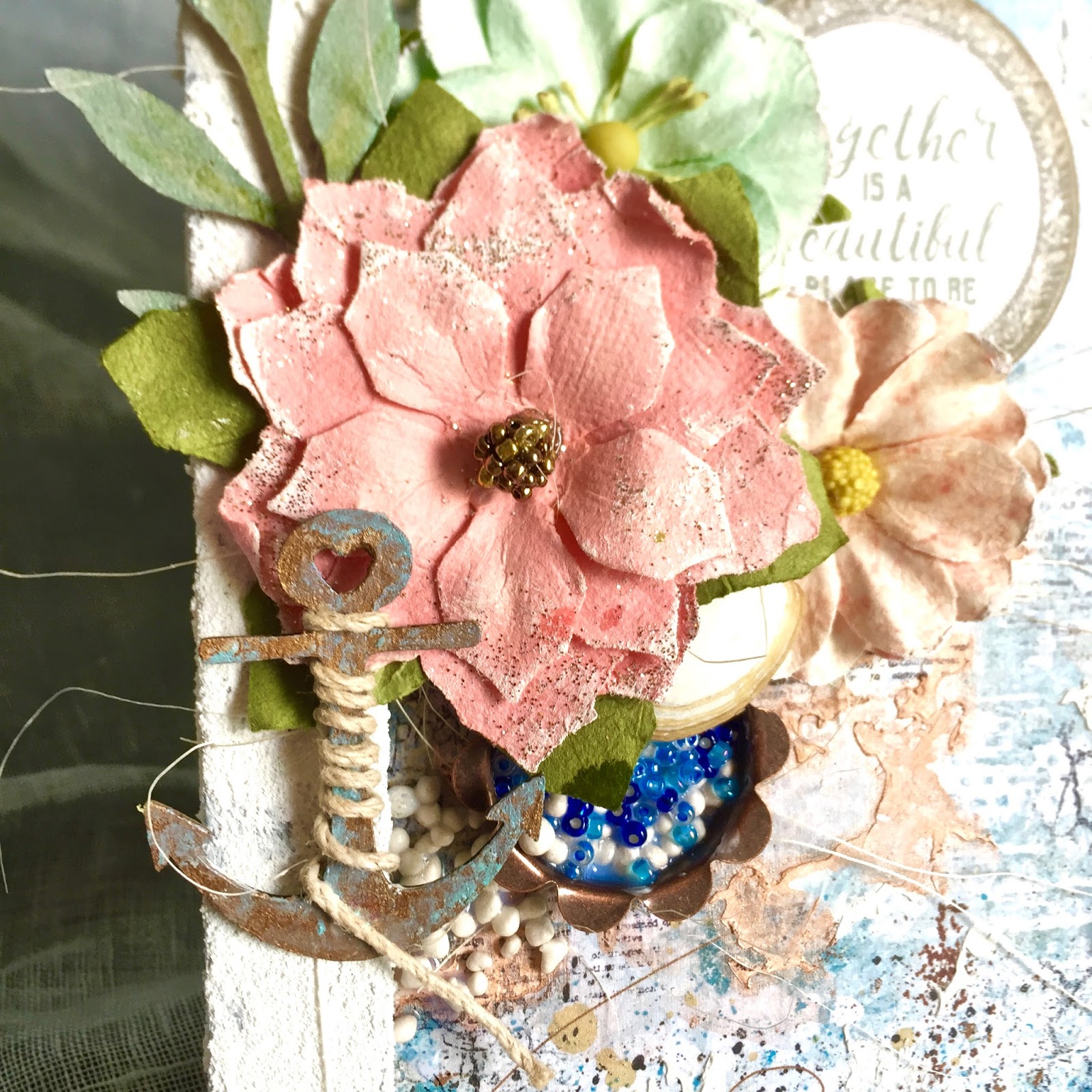
More details in the close-ups:
More details in the close-ups:
In my kit was the Prima Marketing Artisan Powder (designed by Frank Garcia, one of my favourite scrapbookers). It's a pretty amazing thing and I've used it 3 ways here - dusting it as a pigment on my flowers and fabric trim, using it as a distress color on the edges of my tag and mixing it with gel as a tinted medium I can use over my stencil.


I like to use chipboards in my projects and here is no exception. The wildflower chipboard was first colored with Peacock Feathers distress paint, followed by Shabby Shutters and some dabs of Dina Wakely's acrylic paint in Elephant. Then was a layer of crackle paste from Prima and lastly, a watered down layer of the acrylic paint in Medieval to bring out the cracks. The mushroom chipboard showed the exact same colors except without the crackle.

For my title, I used Dina Wakely's acrylic paint in Gilt to cover the entire piece. What I like about this paint is its rich colors and how easy it is to work with. The small bottles come with a handy fine-tip applicator so you don't end up over dispensing too much paint and waste that good stuff.

A little bit more of some metal bits I've painted over with Prima's acrylic paint in Patina.

And that's all I have for you today. Enjoy your day ahead!