Showing posts with label distressing. Show all posts

Thursday, July 2, 2015

July Inspiration with Blue Fern Studios and a new paper collection!


Hello friends! How has your month of July been? The weather has been blazing hot and we're doing whatever we can to cool down.

It's my turn on the Blue Fern blog today and I have two creations to share with you. The first is based on the fabulous July sketch. Here is what it looks like:


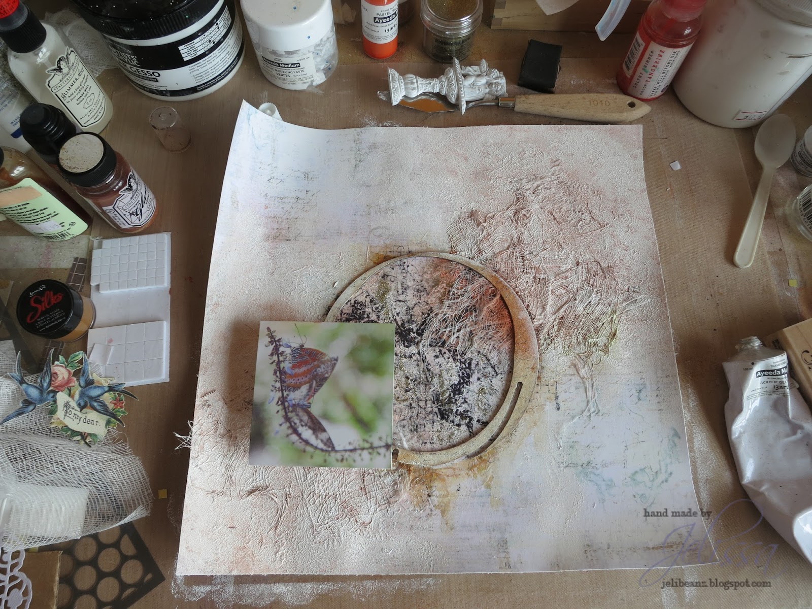
I've kept the orientation of the sketch, as well as the dark background and my papers came from a mix of Sanctuary and Love Story to create my layout.


My mixed media background was created Birdsong Melody from Sanctuary, with a lot of paint dabbing with 13@rts matt and metallic paints, and layering with watercolors, as well as textural details using microspheres, dew drops and microbeads (also from 13@rts), as well as some string and stamping. I love it that Blue Fern tries in sneak in a few dark colored patterned papers into their collections for us to create our very own backgrounds.

Some close-ups:


The La Plume chipboard which I first painted with a light brown, followed by UTEE embossing for resist and layering with more browns. Beneath are paper layers made from scraps I had left over from Love Story collection.


The Notebook Edges chipboard, which I first heat embossed and then colored with different shades of blue. To add texture to my layers, I mixed chipboard, paper, lace and trims.


A close-up of some of the textural details I have in my background.

I hope my sample has inspired you to create a project of your own to participate in our monthly sketch challenge!


And now for my video tutorial. For this project, I revisited one of my all time favourites from Blue Fern Studios, the Ombre Dreams collection. 


I used only "Susan's Dream" because the images on the paper fit my composition perfectly and had the exact type of watercolor imagery I had in mind to create for my background. I also used scraps from Dream Cards and Charlotte's Dream to build up my layers.

Some close-ups:


A die cut from Dream Cards which I used as my title, and a Bohemian flower piece tucked into my cluster. You can also see the half-tone stamp which I used to add minute details to my background.


I love the big chipboard pieces because they are simply value for money and so fun to play with. Here, you see Medley Border which I have cut up into four pieces and tucked them everywhere to maintain the flow of my composition, as well as to break up the monotony of paper layering.


Interspersed in the layers is also the Notebook frame which I had added some texture to.

Here is the start-to-finish video. I hope you enjoy watching it as much as I have creating the project.


And before I sign off, Blue Fern Studios has a fabulous new paper collection with matching stamps and chipboards, and I can't wait to show this one off to you!

Here's the collection:


and the full reveal can be seen here.

So that's all I have for today. Keep safe and keep cool!

love,


Thursday, June 25, 2015

Great Outdoors with Maja Design

Hello friends!

Popping in on a Thursday afternoon to share my latest project for Maja Design. My fingers were all purple and white after completing it, but what I really want are green fingers! Let me tell you why.

Firstly, here is the project:


I'm using the Antligen collection from Maja Design, which is really all about Springtime and the earth coming back to life with beautiful flowers after a long cold winter. Well, the photo I chose was one I took of my favourites - Lavender Augustafolia, but that was in autumn. Now, the climate here in Singapore is really not suitable for growing lavender because of the over-bearing humidity which kills off the plant by encouraging root rot. In my last tries, I managed to get the seeds to germinate and sprout, and then suddenly they all died off after a month. Then someone gifted me a pot of blooming ones, but they all never survived more than two months even with full sunlight and careful watering. Bear in mind I'm someone who can actually kill cactus.... So when we booked ourselves into the Lavender and Berry farm on our Perth trip, you can imagine how gaga I went over the gorgeous flowers in bloom. And it was effortless for them. *Green eyes* Now I'm trying to grow some cherry tomatoes but they all seemed to have stopped at the seedling stage. Maybe I should give up and just paint my fingers green instead.

So my long story aside and back to the project. I've kept my paper layering to a minimum and focused a lot more on the background details this time round.

More in the close-ups:

Back to my usual style of tucking in those gorgeous Blue Fern Studios chipboards in between my papers. I have strips of green and purple paper from the Antligen collection, as well as some fussy cut flowers from the collection to fill out the composition nicely. The chipboard I colored with Shimmerz Inklingz, 13@rts Purple Metallic and Lavender Matt paints, and adhered clear Distress Glitter on the edges.


A closer look at what I did for the background - stenciling and doodling around the relief, sprinkling of transparent and black microbeads, splatters of Twinkling H2O and Purple Metallic Paint from 13@rts. And finishing it all off with the Splash! acrylic inks, also from 13@rts.


Hidden details behind the photo with random stamping, a painted metal water fountain with little roses tucked in. It's starting to look like an English garden! My title is "Great Outdoors", also from BFS and it describes so well my love for everything under the sun.


Filling out the bottom part of the composition nicely with another piece of Blue Fern chipboard. I painted with two different shades of green and sprinkled on clear microspheres when the paint is wet. And just in case, I sealed the beads with a thin layer of gel medium. 


 So that's all I have for today. Before you go, I would love to hear some of your gardening wins and woes too!

love,


Friday, February 13, 2015

BFFs with 13@rts

Hello 13@rts fans!

Today is Friday 13th, but not an unlucky day because I have a little photo tutorial for you. And because tomorrow is Valentine's Day, I created a layout all about a most beautiful kind of love. But before that, here are the step by step instructions.

Step 1


Mix gel medium with some distress glitter. Use it as a paste over a stencil on your background. My paper is from Olga Heldwein's fun and versatile Color Basics collection.

Step 2


I'm making lots of layers here with more papers from the same collection, some burlap cloth which I got very cheap from a wholesaler, and also tucking in some chipboards for movement.

Step 3


Alter the chipboards. Here I patted on modeling paste with a palette knife and sprinkled some microspheres and distress glitter on top. The 13@rts modeling paste is perfect for creating this texture as its foamy and creates very nice peaks.

Step 4


More chipboard altering. First a coat of blue metallic paint over the primed chipboard, then I used my finger to dab the primer all over for a distressed look.

Step 5


Now for the background. After the gel medium has dried, I dipped my paintbrush into some Ayeeda mists and painted over a stencil. It's ok if some of the mists get under the stencil. Just add a bit of water to let it run and it gives a beautiful watercolor effect. Vary the spots where you add water and amounts as well so that you get different shades for dimension.

Step 6


Adding splatters with Sky Blue pearl mist. Follow on with random stamping.

Step 7


Another piece of chipboard which I decided to add in much later. While the metallic blue paint was brushed on, the matte blue and matte turquoise were added by using my finger to dry brush. Then finish off by dry brushing with gesso using your finger.

Step 8


Drawing a border around my layout with black matte paint, metallic blue and gesso, all using the finger brushing technique.

And here is the finished layout of my eldest and his BFF - a little lamb.


Some close-ups:


I hope you like what I have shared today. Now I'm off to the cinema with some girlfriends to Fifty Shades of Grey, and I hope your weekend is as good as mine!


Thursday, December 4, 2014

This is Life - a special project for Once Upon A Sketch with 13arts

Hello everyone!

How was your first week of December so far? I'm just absolutely stoked because it's nearly the end of 2014 and new adventures beckon in 2015.

But first, let me share a special project with you, created for the final sketch at Once Upon a Sketch, using beautiful mixed media products from 13arts. As you may all know, our beloved leader Nadia is closing the challenge blog next year and it is indeed a sad time for everyone. OUAS holds a special place in my heart as one of the first few challenges I took part in, won something and even got on the DT. Working alongside so many talented people have taught me much and I've made many friends along the way. So here's a special project as my way of saying goodbye.

This is the sketch:


And journaling theme:
Journalling Theme: "It's December..." 

You are free to interpret our theme ANY WAY you like. It is for your inspiration and this theme word DOES NOT need to be part of your title or journalling. But please make sure your layout is based on the sketch below and includes journalling (hidden journalling is fine). Acceptable journalling is MORE than just a sentence, or generic writing such as date/place etc. It needs to be present and at least 3 lines long. Remember, hidden journalling (under a photo/tag or behind your page) is perfectly fine but please DO let us know in your post where your journalling is! 

And my take on the sketch and theme:


Here at the equator, all we get in December is rain. Lots and lots of rain. And wonderful monsoon winds that brings a respite to the hot humid weather we get for the rest of the year. With rain comes puddles. And with puddles... well there's no way you can stop a kid (or a young-at-heart adult) jumping into one of those and making a splash.

December is also a time when I cuddle up (because it's cold and windy) and start to take stock of the year that has passed, to reflect on how I have lived my life the past 12 months. If any time is a good time to come up with "emo" philosophical metaphysical life quotes, December is the time to do it LOL

My journaling (on the back page) reads:

"December. A time of rain, a time of reflections. Jumping into puddles, making a splash. In this year that has past, I hope I have made some splashes, had some fun and made ripples that would result in small but meaningful changes to other people's lives."

Here are some close-ups:


The layout was created with tons of 13arts products, which I absolutely love. Featured are the new metallic paints by Olga Heldwin, the new mist colors as well and the new paper collection Cozy Evening by my boss Aida. Tucked in between the layers are also the Splattered Circles chipboards from Blue Fern Studios. It was such a joy making this and provided the art therapy that I sorely needed.

And lastly, a start-to-finish video of how I made this layout:


That's all I have for today. Thank you for dropping by. If you have the time, please go by the Once Upon A Sketch blog to leave your farewells and wishes for Nadia and the rest of the team.

love,

Sunday, October 19, 2014

Operation Salvage... and a double challenge entry

Good day friends! How has your weekend been so far? We're having a great time as the weather seemed to have mellowed a little and it was wonderful to be outdoors.

So today I bring to you something different. Instead of showing you the reveal at the beginning, I'm gonna leave it at the end just to explain how unbelievable frustrating the process of creating can be. It started out with a bad cold, which means I'm not thinking straight and that sometimes mean that my mojo gets as blocked as my nose.

So after some false starts, I ended up with this:


This was a photo I posted on my Instagram feed. The first attempt comprised of some doily stenciled designs and lilac mist, which I thought looked blah. So I made my own tissue paper collage and sealed it with some Ayeeda gel medium. Looking good so far.... 


And this happened. Nice try, lifting the color orange from the butterflies but IT. WAS. DISASTROUS. I know some of you may say this looks fine, but it was the exact opposite of what I had in mind. So this is one manifestation of two different syndromes that I currently suffer from: (1) the "Let's try this color and see how it goes. Oh SHIT..." syndrome and (2) the head-eye-hand-mis-coordination syndrome. At some point, we all face frustrations in translating the image we visualize in our head to reality. Sometimes it has to do with a mental block, sometimes it's a matter of finding the right techniques to help us express ourselves. 


And so Operation Salvage kicked in. I love it that many of my talented friends dabbling in mixed media find it fun when something goes wrong. It's that attitude of being able to restore something and transform it into something else; turning a mistake into a miracle. It's wonderful what some gesso can do. That's why it's my BFF. Now it doesn't look that loud anymore, but I still have to think of a way to add in texture and colors to create the look I had in mind. 


So repeat tissue paper collage.


Dab gesso randomly for a softened and whitewashed look and some gold glitter. Now we're talking!


Instead of using mists and paints, I whipped out something I've neglected to use for about 2 years - my stash of Pan Pastels. These are the Pastel tints which I bought but never found the chance to use. It seemed like the perfect opportunity to exhibit them now because of the soft cast they give.


Love that look! Now it's looking even closer to what I'm seeing in my mind.

Here is the sketch from Prima BAP and mood board at Scrap Around the World which I was trying to create this entry for:


And the final product of Operation Salvage:


I flipped the sketch and borrowed some elements from the mood board. The butterflies are my main inspiration and the picture I used was from one of my trips to the Butterfly Park in Penang. There are actually two of them on the stem and because it was such a delicate moment, I used the softer version of the colors Rachael had on the ring and also sprinkled bits of gold glitter around to show the classiness of these winged dancers. You can also see a bird cage, and I tucked resist canvas butterflies in the garden I created out of Prima flowers (there was fabric in the mood board as well). And don't forget the giant butterflies on my tissue paper in the background!

Some closeups:


So that's the story behind this page, and it was a fun one for me to share with you. Yes we have all at some point lost our mojo and end up staring blankly at our papers, determined never ever to touch this stuff again. Yet time and time again it's the journey we take every time we pick up our scissors, pen, brush (whatever it is you use to create) that moves us so deeply, and draws us back to this thing we call creating. To my friends who feel discouraged sometimes or are new to this, don't be afraid to make mistakes because there's always a beautiful lesson hidden inside.

Have a great week ahead!
love,