Monday, October 27, 2014

Mini Canvas for 13arts

Hello friends! 
How was the weekend for you? Mine was really, really busy!

Today I'm up on the 13arts blog with a technique post on just two different ways you can use modeling paste.

Here's the project:


In this project, I have kept my embellishments to the minimum to show the two ways Ayeeda modeling paste can be used.


The first way is very commonly used - to emboss. When applied without any spreading or flattening, the more modeling paste you have the more raised the surface. You can manipulate your palette knife to create more "peaks" for a rougher texture. Another way to emboss with modeling paste is to use it over a stencil (both methods of embossing can be seen in this photo) to get a raised pattern. 


What goes up must come down. The second way to use acrylic modeling paste is to de-boss. Instead of creating peaks (or raised surfaces), you are making depressions. As seen in the photo, I have spread some Ayeeda modeling paste over my canvas, and stamped some script into the modeling paste. The stamped design presses into the paste and creates depressed script, which I further enhanced by misting with a darker and contrasting color (Pastel Lavender vs Chalk Caramel and Chalk Yellow).


Here's another example of de-bossing with modeling paste.


 So that's all I have for you today. Thanks for dropping by the blog and have a great week ahead!

 love,

Thursday, October 23, 2014

Quick Tag for Marion Smith Designs

Hello friends!

It's been a crazy, crazy week with both the boys and me sick. But I managed to make a really quick and simple mixed media tag with some gorgeous Marion Smith Designs products.


Many of us end up with odd-sized papers after projects and I like to keep those because you never know when they come in handy. So I managed to steal about 30 min of craft time and use up some of those scraps.

To make this tag, I used papers I have from the Up and Away sheet from the Nirvana collection, as well as some bits left from Mad Tea Party. I took the Up and Away sheet and adhered it onto a product packaging as a backing and trimmed for a tag shape. Next was to tear some strips off the Alice paper from Mad Tea Party and layer them. I also cut out the floral basket from the same piece of Alice paper and did more layering with a cardstock doily and chipboard. 


The white cabbage rose resin from Junque and Gems. Love that they come in white so that I can paint them. A tip to share: the surface of this particular resin is very smooth and doesn't hold paint well, so I primed it with gesso before proceeding. After that, the 13arts matt paint and Silk Acrylic I used for coloring stayed on beautifully. I also tucked in a piece of Tattered Diamonds chipboard from Blue Fern Studios as the Alice paper in my layers had repeating diamond motifs. 


The floral basket which I fussy cut out, and you can see the repeating diamond motif which I borrowed from the Alice paper. 

That's all I have for you today. Thanks for dropping by and have a great weekend!

 love,

Sunday, October 19, 2014

Operation Salvage... and a double challenge entry

Good day friends! How has your weekend been so far? We're having a great time as the weather seemed to have mellowed a little and it was wonderful to be outdoors.

So today I bring to you something different. Instead of showing you the reveal at the beginning, I'm gonna leave it at the end just to explain how unbelievable frustrating the process of creating can be. It started out with a bad cold, which means I'm not thinking straight and that sometimes mean that my mojo gets as blocked as my nose.

So after some false starts, I ended up with this:


This was a photo I posted on my Instagram feed. The first attempt comprised of some doily stenciled designs and lilac mist, which I thought looked blah. So I made my own tissue paper collage and sealed it with some Ayeeda gel medium. Looking good so far.... 


And this happened. Nice try, lifting the color orange from the butterflies but IT. WAS. DISASTROUS. I know some of you may say this looks fine, but it was the exact opposite of what I had in mind. So this is one manifestation of two different syndromes that I currently suffer from: (1) the "Let's try this color and see how it goes. Oh SHIT..." syndrome and (2) the head-eye-hand-mis-coordination syndrome. At some point, we all face frustrations in translating the image we visualize in our head to reality. Sometimes it has to do with a mental block, sometimes it's a matter of finding the right techniques to help us express ourselves. 


And so Operation Salvage kicked in. I love it that many of my talented friends dabbling in mixed media find it fun when something goes wrong. It's that attitude of being able to restore something and transform it into something else; turning a mistake into a miracle. It's wonderful what some gesso can do. That's why it's my BFF. Now it doesn't look that loud anymore, but I still have to think of a way to add in texture and colors to create the look I had in mind. 


So repeat tissue paper collage.


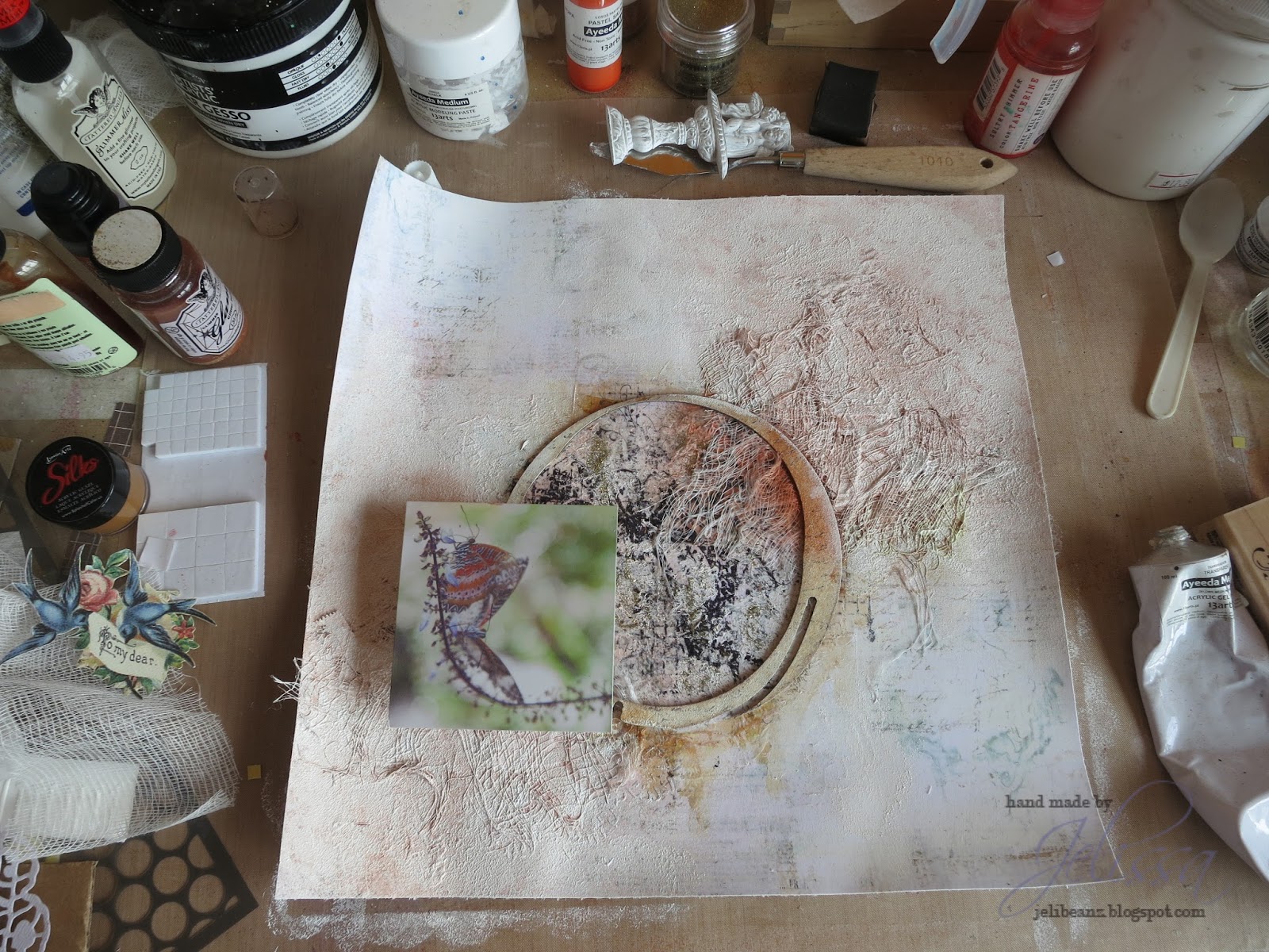
Dab gesso randomly for a softened and whitewashed look and some gold glitter. Now we're talking!


Instead of using mists and paints, I whipped out something I've neglected to use for about 2 years - my stash of Pan Pastels. These are the Pastel tints which I bought but never found the chance to use. It seemed like the perfect opportunity to exhibit them now because of the soft cast they give.


Love that look! Now it's looking even closer to what I'm seeing in my mind.

Here is the sketch from Prima BAP and mood board at Scrap Around the World which I was trying to create this entry for:


And the final product of Operation Salvage:


I flipped the sketch and borrowed some elements from the mood board. The butterflies are my main inspiration and the picture I used was from one of my trips to the Butterfly Park in Penang. There are actually two of them on the stem and because it was such a delicate moment, I used the softer version of the colors Rachael had on the ring and also sprinkled bits of gold glitter around to show the classiness of these winged dancers. You can also see a bird cage, and I tucked resist canvas butterflies in the garden I created out of Prima flowers (there was fabric in the mood board as well). And don't forget the giant butterflies on my tissue paper in the background!

Some closeups:


So that's the story behind this page, and it was a fun one for me to share with you. Yes we have all at some point lost our mojo and end up staring blankly at our papers, determined never ever to touch this stuff again. Yet time and time again it's the journey we take every time we pick up our scissors, pen, brush (whatever it is you use to create) that moves us so deeply, and draws us back to this thing we call creating. To my friends who feel discouraged sometimes or are new to this, don't be afraid to make mistakes because there's always a beautiful lesson hidden inside.

Have a great week ahead!
love,


Saturday, October 18, 2014

The Art of Faith

Hello friends!

Today is my turn on the 13arts blog and I have a special page to share with you from my art journal. I shared the cover I made for the art journal in my debut post for 13arts and have been creating in it ever since. But because the pages inside are very personal, I don't really post them anywhere. Today's page I'm sharing is something I hope can inspire you as the message in it has inspired me. I made it after a friend shared something personal with me.

Faith


The paper was primed with gesso and I used lots of 13arts goodies to create the background. There was dripping across the two pages, paint splatters with Ayeeda mists, and I used a mixture of gel medium and Matt paint for the stenciled details. Underneath all that layers are some sheets of hymn music which I torn out from a hymn book that is at least 100 years old. My uncle found it in London and gave it to me, but I feel so heart-pained when I had to tear it out from the very old book.

Close-ups:


I went a little crazy with altering the chipboard from Blue Fern Studios - first I did some gel transfer with Ayeeda gel medium to create a distressed paper texture. Then I painted the surface with Ayeeda mists and paints, dabbed gesso for a even more weathered effect. For more dimensional look, I mixed liquid medium with Pearl Gold paint and dabbed it randomly over the chipboard so that they look like  - gold pearls!


More altering of the flowers with Ayeeda paints, and my favourite Gold Pearl which I find that I must use in almost every project that I create. 


Another angle of the page where I have a die cut doily which I distressed with the Gold Pearl paint. 

This is all I have for you today, thanks for dropping by!


Wednesday, October 15, 2014

OUAS October Sketch Challenge

Hey there awesome folks!

I'm in today to share my take on the Once Upon a Sketch challenge for October. I took a break from it in September because of some crazy in the schedule but I'm back! Nadia has another beautiful sketch and theme for us to play along with this month.

Here's the theme:

Journalling Theme: "The women/girls etc in our lives..." 

You are free to interpret our theme ANY WAY you like. It is for your inspiration and this theme word DOES NOT need to be part of your title or journalling. But please make sure your layout is based on the sketch below and includes journalling (hidden journalling is fine). Acceptable journalling is MORE than just a sentence, or generic writing such as date/place etc. It needs to be present and at least 3 lines long. Remember, hidden journalling (under a photo/tag or behind your page) is perfectly fine but please DO let us know in your post where your journalling is! 


So for the August challenge, I scrapped about my Dad so it seems almost natural to scrap about my mum this time. Well, no. I chose to scrap about my Dad's Mum instead (that would be Grandma, by the way) because this is an emotionally overwhelming topic for me. Memory-keeping doesn't always have to be about the happy stuff, but also lessons that we keep deep in our hearts that we hope we never ever forget. 


So here's a photo of Grandma with my brother, because I couldn't find a photo of her and me. She has been such a pillar of strength in the family with a fierce character, but beautifully tender-hearted when it came to the poor and needy. As a devout Buddhist, she would travel to the temple everyday to cook for the people there (for free, and her culinary skills.... OH MY.....). Once she had a dream about an orphan who was wandering in our backyard searching for its family (I never knew the gender) and during the Hungry Ghost Festival, she put out an extra meal for the orphan. Being a Christian, I didn't buy into all these but it was quite something witnessing her unconditional kindness and generosity. My aunt, whom I'm closest to, was one of the two children Grandma adopted into the family just so that they won't be left alone in the streets. Although, you have found it ridiculously hilarious to hear stories about how she chased Grandpa down the road with a meat cleaver because of something he said. 


We all lived under the same roof, so Grandma took very good care of us. So some family issues came up along the way as Grandma got older, and we grew apart. Can't really say what those were as they are personal family stuff, but I was filled with tremendous regret that I hadn't been a better granddaughter to her while she was still alive. I was respectful and all, but things could be better and it weighed heavily on my heart that I didn't manage to build a deeper relationship with her. Like my Grandpa, she passed away suddenly but peacefully in her sleep without any pain or suffering. It still tickles us to think that just the morning before she passed away, she was still yelling vulgarities at her BFF (this old auntie who lived near us) for doing something stupid.  Such was the extreme ends of her character, which we found so endearing and incredible. 

Anyway, some closeups:


I don't usually scrap red, but because of the photo, and also because of the sacrifices she made to keep the family going, and also ... because of the terrifying amount of chili and spice she would put in her cooking, I used some really hot colors here. "Lifetime" from Blue Fern's Chunky Words as my title, just to celebrate her life of kindness and loyalty to the people around her.


A floral cluster. I used lots of 13arts paints and chalk mists, especially my favourite Gold pearl paint because of Grandma's heart of gold.


Another Blue Fern chipboard which I did lots of altering by layering paints. My journaling is all the words that I never got to say to Grandma, and it's written on the back of one of the layers of paper (from 7 Dots Studios) matting my photo.

So that's all I have for you today. If you have the time, why not take part in this month's challenge and celebrate the women in your life?

love,

Sunday, October 12, 2014

October Challenge at 13arts

Hello friends!

It's my turn to host the monthly challenge on the 13arts blog and I have something lined up that will get your creative juices going!

Rules of the challenge # 23:


1. Use a white background for your project. It can be cardstock, watercolor paper or patterned paper. You can have motifs and designs that are coloured but the base must be white and the white should still be visible after all your alterations.
2. Use a black and white photo. For cards or art journals, your sentiments/journaling should also be in either black or white.

3. The colours on your project should come from paints or mists, or any other colorants (distress inks, water colors etc). This applies to embellishments as well ie. if you use flowers or letters, they should be white or cream and you color them with your paints or mists. There's no restriction on what colours you want to use - you can have rainbows or you can have all black and white.
4. A song (title or words are ok, in your language of choice) as your theme/title.
5. Publish your project on your blog and add link directly to the post using Inlinkz tool at the end of this post (on the 13arts blog).
6. Please add link and info about our challenge, where your work is published.
7. You may submit as many entries as you like.

8. You can enter with your project to maximum 2 other challenges and your work must be new, not published before our challenge has started.

9. The challenge ends on October 26th at 23:55. Winners will be announced on October 30th, 2014.


When the challenge ends, our Design Team will vote and pick the best project. It will be awarded with shopping voucher for 13 arts store worth - 60 PLN with free international shipping. The winner will be invited to join us in one of our challenges as Guest Designers. Additionally we will feature few works with biggest number of points.

Here's my take on the challenge:


Here's a photo of husband and firstborn which I think I must have scrapped at least 5 different layouts for. I love the combination of blue and purple, something which I have not tried before and it turned out quite gorgeous with bits of silver here and there. My title is from one of my favourite songs by the Carpenters', and if you know the words to that song, you'll see I have my embellishments that correspond to the words.

Some closeups:


A flower I altered with Lavender Pastel Mist.


Star-stenciled gel medium sprinkled with embossing powder 


More stars using Blue Fern Studios chipboard, and lots of texture in the background. As well as more altered roses.

Here's a start-to-finish video of this layout and I hope you enjoy it! As I was uploading the video I realised there is only 6 more to go to reach 500 subbies on Youtube! So here's a little surprise - a small giveaway happening once we hit 500. How about that! To enter, just subscribe to me on Youtube, share this giveaway and leave a comment below to say you have done so.


And remember to check out the rest of the DT's take on this challenge and why not try it out yourself to see what you can do with a white sheet of paper? That's all I have for today, thanks for dropping by!


love,


Thursday, October 9, 2014

Color Splash Fun for Marion Smith Designs

Hello friends!

I'm up on the Marion Smith Designs blog today to share a layout I created using the Mad Tea Party collection.


That's a photo of eldest playing with bubbles and I have edited the photo for a saturated look. Using my 13arts mediums and some Twinkling H2Os, I created a colourful background to match the tones in the photo. 

Some close-ups: 


A balloon stamp from the Flying High stamp set. I misted the stamp and pressed it down on a scrap piece from the Garment District papers. Then it doing the outline in black with a Faber-Castell Big Brush pen to get more defined lines, and stamping it over the first image. This was followed by some masking and misting, and more stamping with a small motif stamp from the same set. The little metal balloon is also from Junque and Gems.


A white resin flower which I misted with Ayeeda Chalk mist to give it a peach tinge. I also built up layers under my photo using cut-outs from the Cut and Create sheet, also from the Mad Tea Party collection. Tucked under that, and also my title are some chipboard pieces from Blue Fern Studios (Ups and Downs Panel, and Chunky Words)

And that's all I have for today. Thanks for dropping by!

love,

Wednesday, October 8, 2014

October Workshop at Made With Love

Happy mid-week friends, the weekend is just two more days away!

Today I'm in to do a little bit of ra-ra for my October workshop with Made With Love.

Here are some sneaks:


There will be a lot more layering and chipboard altering techniques to be covered in this workshop, as well as learning the different ways you can use your soft gel and a chance to try out one of my favourite techniques - splattering. Also, see how you can use gold (the new black) to accent your pages and make it come alive.

Workshop details:

Dates - 11 Oct (2.30 to 5.30 pm), 30 Oct (6.30 to 9.30 pm), 7 Nov (6.30 to 9.30 pm)
Workshop Fee: $55

To reserve limited spots, call MWL at 6733 6730

Sunday, October 5, 2014

Little thoughts goes a long way with OTRS

Hello friends!

How has your weekend been? I'm back in on a Saturday while my beef rendang (that's a Southeast-Asian beef curry, absolutely yummy!) is simmering in my brand new Dutch oven. Hooray for weekends when we have friends over to join in my culinary adventures :D

I have two projects for Off the Rails Scrapbooking to show you, and both are made with papers and chipboards from Blue Fern Studios. The first is based on this month's challenge:


What a pretty and vibrant color palette! Although I managed to make it all sweet and pretty with the new BFS paper collection Montage for a mixed media card:

The background was created with 13arts Ayeeda Matte Paint in Blue, and some stenciled designs using Ayeeda Acrylic Modeling Paste. I also added some random stamping as well.


The chipboard (Marakesh, Blue Fern Studios) was painted with Bourdeaux Pearl Mist from 13arts and dabbed with some Ayeeda Gold Pearl paint. Love the shimmery look it adds. The sentiment for the card came from one of the sheets of Montage paper.

My second project is a quick and easy mini-tag which I made for my mixed media workshop students at Made With Love. This was created with another Blue Fern paper collection Ombre Dreams.


I've used papers from Blue Fern Studio's Ombre Dreams collection as my background. This particular sheet is white-washed with bits of color, so it was perfect for whatever other mediums I wanted to add on subsequently.

I mixed in some Lindy's Stamp Gang's Magicals to tint the soft gel I was going to spread over a butterfly mask for the background. After that was some simple stamping with a word stamp.

Next, I took a chipboard which I cut out a bird cage with a Sizzix die and painted some metallic distress crackle paint over it. If you're using crackle medium, prime your surface with gesso first as it will help the medium to hold.

Lastly, it was adding bit of splatters with a mixture of Ayeeda Liquid medium and black acrylic paint.

Here's a close-up where you can see the stenciled soft gel butterflies better. Soft gel is a wonderful alternative to texture paste and it retains whatever color you add to it (it dries transparent), and still give a subtle look where your background paper is still visible. 


That's all I have for today. Thanks for dropping by!

love,