Showing posts with label shabby chic. Show all posts

Wednesday, September 2, 2015

September Inspiration with Blue Fern Studios

Hello friends and welcome to the month of September!

Things are definitely going at warp-speed for me now that little Queen Elsa is due any time now. Sometimes I do feel like I'm getting affairs in order, which sounds so morbid!

Anyhow, I'm in today to share my September creations for Blue Fern Studios. I couldn't resist using the sketch that Michelle has created for this month's challenge even though I had a different project planned. So here is her sketch:


And my take on it:


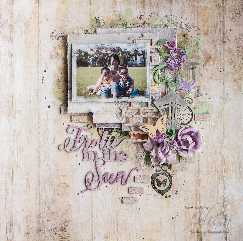
I've never used so much purple before! But the soft palette of the Deja Vu papers made it so easy and pleasing. This is one of my favourite photos of Number 2 and hubby - don't they look so happy with their bright smiles?

Lots of close-ups:


My title, which I have left untouched but just simple priming with Ayeeda gesso. Not forgetting the paper layers I have under my photo.


Part of the Circle Vine chipboard which I used to frame my photo. I had cut out one end so that the whole piece fits and still gives me the flow I wanted for the page. This was colored with Shimmerz Inklingz and Twinkling H2Os.


Die cut doily from one of the Deja Vu sheets.


Using the collection title from the info strip as a sentiment in my top cluster. I used the Deja Vu stamp set to create a resist for my watercolor background, plus the little piece which I had snipped off the Circle Vine chipboard. I also added some beads and distress glitter for extra texture.

My next share is a educator video I've created. I had wanted a relatively simple layout without too much clusters and a comfortable amount of white space. 


Again, using Deja Vu papers. I can't seem to get enough of this gorgeous collection! The drawings on this paper is so subtle but yet they actually help to create a visual flow that framed my main cluster beautifully.

Many, many close-ups again:


The Township Collage chipboard which I had altered in a few different ways.


I've always wanted to use that bird cage stamp!


I like the dangling trinkets in the Deja Vu stamp set a lot because of the intricate details they have, just like BFS's laser-cut chipboards. 


My title piece.


Main cluster with the pretty papers all layered up and I sneaked in bits of lacy flowers.

And here is how I created this page:


have a great month ahead!

love,


Thursday, July 9, 2015

Summer Love with Maja Design

Hello friends!

Summer is upon us! Although here in Singapore, it's nearly summer all year round. Right now, I'm enjoying a nice, cold bowl of iced fruits in syrup, catching up on summer dessert recipes, and attempting to bake a cake for the little one's birthday in a couple of days.

While all that is going on, I've a sweet, sweet treat from Maja Design to share with you. Marie has drawn up a gorgeous collection for summer and it's unbelievably cute! Today's project is one of the many that I've made from her Summer Crush collection and I can't stop making more. Here's a step-by-step on how I made the layout.

Step 1:
Summer is all about fun right? So I had these mini rosettes made using papers from the Summer Crush collection with one of my Sizzix dies and they are just too cute.


Step 2:

For some reason, straws came to mind as well and I rolled these up. Just lightly spritz with water to make the heavy patterned paper easier to roll and glue down the edges with Glossy Accents. I then brushed the ends with gel medium and dipped it into gold embossing powder.


Step 3:

I primed these chipboards from Blue Fern Studios and painted them. For the title "Love", I used 13@rts' Metallic Pink and Raspberry matt paint and blended them. For the arrow, I applied Shimmerz Texturez in Patina and went over with a layer of Silks Glaze in African Jade.


Step 4:

Assembling my paper layers and embellishments together so that I can start working on my background.


Step 5:

Spread a very thin layer of gesso over the area where I wanted to work on, followed by some stenciling with modeling paste to follow the general flow of my layout. I constantly placed my paper layers down as a guide over the stencil to see where else I should add the modeling paste.


Step 6:
Misting with Tattered Angels' Glimmer Mist (Trunk Bay) and watering it down. Some parts I painted straight from the bottle for gradations in tone. Finish with some random stamping, and start gluing everything away!


Here is the completed page:


Love the summery feel this piece has! But I have a confession - I cheated on the photo because it was taken in fall during our Perth trip. But it was the perfect kind of weather which I wish Singapore would have in summer (or throughout the year for that matter!) - balmy temperatures, refreshing breeze, blue skies dotted by little white clouds, and that amazing picnic in the park... I deliberately chose the patterned paper with the sunburst because it adds to the composition - sun rays radiating out from my main cluster and that pattern is repeated in my mini rosettes.

More details in the close-ups:


Lots of touching up with mediums.  I made more splashes with 13@rts Light Turquoise chalk mist all over the page, followed by Acrylic Splash! Ink in white. 


Everything was also given a dab of gesso for a vintage washed out look, followed by African Jade Silk glaze. And lastly, a generous patting of a yummy paste made from Gold Pearl paint and 13@rts Magic powder.


Loving the patterns and colors from the Summer Crush collection.


Another floral cluster with a metal piece and some resins.

That's all I have for today. Thanks for dropping by!

love,

Thursday, July 2, 2015

July Inspiration with Blue Fern Studios and a new paper collection!


Hello friends! How has your month of July been? The weather has been blazing hot and we're doing whatever we can to cool down.

It's my turn on the Blue Fern blog today and I have two creations to share with you. The first is based on the fabulous July sketch. Here is what it looks like:


I've kept the orientation of the sketch, as well as the dark background and my papers came from a mix of Sanctuary and Love Story to create my layout.


My mixed media background was created Birdsong Melody from Sanctuary, with a lot of paint dabbing with 13@rts matt and metallic paints, and layering with watercolors, as well as textural details using microspheres, dew drops and microbeads (also from 13@rts), as well as some string and stamping. I love it that Blue Fern tries in sneak in a few dark colored patterned papers into their collections for us to create our very own backgrounds.

Some close-ups:


The La Plume chipboard which I first painted with a light brown, followed by UTEE embossing for resist and layering with more browns. Beneath are paper layers made from scraps I had left over from Love Story collection.


The Notebook Edges chipboard, which I first heat embossed and then colored with different shades of blue. To add texture to my layers, I mixed chipboard, paper, lace and trims.


A close-up of some of the textural details I have in my background.

I hope my sample has inspired you to create a project of your own to participate in our monthly sketch challenge!


And now for my video tutorial. For this project, I revisited one of my all time favourites from Blue Fern Studios, the Ombre Dreams collection. 


I used only "Susan's Dream" because the images on the paper fit my composition perfectly and had the exact type of watercolor imagery I had in mind to create for my background. I also used scraps from Dream Cards and Charlotte's Dream to build up my layers.

Some close-ups:


A die cut from Dream Cards which I used as my title, and a Bohemian flower piece tucked into my cluster. You can also see the half-tone stamp which I used to add minute details to my background.


I love the big chipboard pieces because they are simply value for money and so fun to play with. Here, you see Medley Border which I have cut up into four pieces and tucked them everywhere to maintain the flow of my composition, as well as to break up the monotony of paper layering.


Interspersed in the layers is also the Notebook frame which I had added some texture to.

Here is the start-to-finish video. I hope you enjoy watching it as much as I have creating the project.


And before I sign off, Blue Fern Studios has a fabulous new paper collection with matching stamps and chipboards, and I can't wait to show this one off to you!

Here's the collection:


and the full reveal can be seen here.

So that's all I have for today. Keep safe and keep cool!

love,


Monday, May 25, 2015

xoxo for 13@rts, an Epic challenge and Color fun!

Hello friends!

I'm in today on a fabulous Monday to share a layout I created using a mix of my new collection Mental Vacation and Olga Heldwein's Starlight, as well as the gorgeous new mediums in the 13@rts store. I have also entered this for the Epic challenge over at Scrap Around the World where I was also an Epic challenge winner last year, as well as my first time entering for Words and Paintery. The sketch inspiration came from Sketchabilities which I flipped (although I'm not sure whether I'm eligible or not!). It's been awhile since I entered any challenge at all and it was really all for fun!


My background was created with four different Ayeeda paint and mist colors - over a stenciled design with modeling paste on my paper Hallerbos. The inspiration for the colors came from Word and Paintery. To create the textures, I mixed Coral matt paint with 3D fillers and sprinkled on generous amounts of sand grit, more plastic fillers and mica flakes. To seal the whole thing, I painted liquid medium over. Before everything is dried, I randomly arranged black and grey threads around the paste I have made. These were inspired by some of the photos from the SATW mood board.

Some close-ups:


My title which is a chipboard piece from Blue Fern Studios. It was primed with a mixture of black gesso and plastic fillers, and glazed over Violet metallic paint. 


The resin frame was colored with random splatters of Lilac chalk mist. The tags were created with Olga's papers (Sagittarius) which I had distressed the edges with first: a layer of black gesso and secondly, gold embossing powder and sand grit. This was inspired by one of the pictures in the SATW mood board where there was a ring of confetti on the martini glass.


I like to layer Blue Fern chipboards and for this layout, I primed them with white gesso, followed by Lavender matt paint and Violet Purple paint. Then I painted on Lilac chalk mist and watered it randomly before some stamping. Lastly it was a layer of tinted embossing powder and distressing with black gesso. 


One of the fun bits I enjoyed creating are the leaves and vines. These were craft colored when I got them, and I was debating whether to alter them or not. Adventure got the best of me and I primed them with black gesso. Then it was a layer of glaze using Violet metallic paint, followed by stamped script which I embossed in gold. Then I took Gold pearl paint and glazed over the vines 

Wow, that was a lot of altering and layering! I hope you enjoyed the techniques I shared here and use them in your own projects. Thank you for dropping by the blog!

Entered for:


love,


Saturday, May 2, 2015

Moments in Time with Blue Fern Studios

Hi everyone!

Where has all the time gone to? We're already in the month of May and I'm happy to share a layout I created for Blue Fern Studios using the gorgeous new Deja Vu collection.

Here is the project:


I picked these papers from the collection as they matched the colors from my photo quite perfectly. It's one of the very few of me with my kids as I'm usually the one behind the camera.

Here are some close-ups:


Layering gorgeous Blue Fern Studios chipboards with the papers and burlap. I had used quite a number of mediums for this page and the chipboards and some of you have already asked for the colors as well. There will be a full list at the end of this post.


More details here. I'm so glad that my LSS finally brought back the clear crackle medium from Ranger's. So far, it's the best I've used.  Just remember to seal it with gel as the cracks form as they can fall off easily.


My title piece, from "Petite Cartes", and more layering with chipboard, papers and lace.


Creating a velvet texture on my leaves using 13@rts new product - Magic Powder. 


My usual floral cluster.


Some details of the lace and chipboard, which I colored to look like the background paper.


Mini tags made from "Petite Cartes" cut-out.

And here is the start to finish video of how I put this whole page together:


List of mediums:

13@rts - Matt paint (Lavender, Mahogany), Metallic Paint (Purple), modeling paste, sand grit, Pastel Mist (Lavender), Splash! Acrylic Ink (White)
Shimmerz - Inklingz (Coral Reef, Pugnacious Purple, Spotlight White, Tarnished Treasure)
Lindy's Stamp Gang - Magicals (Bells of Ireland Green, Lucky Shamrock Green)
Rangers - Distress Paint (Mustard)
Colorarte - Twinking H2O (Alfafa)


And with a new month, it's a new sketch challenge too! Michele Singh has designed the following sketch and do check out the design team's lovely interpretations of it!


And that's all I have for today. Have a great day ahead!

love,