I'm finally able to share a layout I made of my little girl - it took awhile to get those photos printed! I was very tempted to use the Vintage Baby collection, but thought I would have a bit of fun with a collection that's not baby-based.
Here is the page, made with the gorgeous pinks from Summer Crush:
I choose this particular sheet "Off to meet him" as the background color matches my photo's perfectly. I also liked how Marie has drawn the images such that my photo and clusters can be placed in the centre without being too cliche or flat. My background is very simple painting with pink and brown, and I had added my stenciled lace after the painting so that I get a nice contrast of white against the colors. Usually my stenciled designs get lost in the colors I add so this is one way of letting them stand out.
Some close-ups:
My layers of papers, made from scraps from the same collection. I also have a piece of chipboard which I tucked in between and colored with various dimensional and distress paints.
My floral cluster to make it more feminine. Underneath is a spare die cut leaf which I had from a previous project made with Enjoying Outdoors.
And my title which I had colored with gelato and watercolor pencil to match that of the ladies in the corner.
And that's all I have for today. Thanks for dropping by the blog!
We've had a fabulous one, traveling across the Causeway and into Legoland Malaysia with a few of our church friends. Both husband and I are not very comfortable with driving in - because of the jam at the immigration (which we had spent up to 3 hrs in when we used to travel in for our weekend dive trips) and also because Johor isn't as safe as it used to be. So with 2 pre-schoolers and an infant in tow, you can imagine how reluctant we are. So when friends told us that they were planning a trip, we jumped in immediately because there's safety in numbers, and we could do with some lovely company. In any case, it was a wonderful and successful trip - the boys (from age 3 to 13) had so much fun playing together and the adults had a nice break away from the office. I'm still kinda glued to the baby though, and have sort of resigned to the fate of a walking milk dispenser.
And today, I'm up on the 13@rts blog with a Christmassy creation. It's only about 1 month away and I'm really looking forward to all the festivities, merry-making and getting together with friends. I'm not much for green and red and gold, but this card was so much fun to make.
I used very simple supplies for this card as I wanted a minimalist sort of look with plenty of white space. To create some texture with a white-on-white effect, I spread modeling paste over one of the new Christmas stencils and sprinkled distress glitter on top while wet. I also die cut and embossed a white snowflake from cardstock paper.
Some close-ups:
I rested my white cardstock background on a sheet from Olga's Winter Tales collection. Love the wood grain design because it conveys such a cosy feeling of evenings by the fire in a tidy little cabin. I had also cut out tags from the collection and layered with a gold leaf and a chipboard from Blue Fern Studios, colored with Woodbine glitter paint. The flower was painted with green glitter paint and I sprinkled some of the gold microspheres inside. The title "Hope" is what I'm praying for this season - that hope will overcome all the evils of this world.
I dripped some Green glitter paint down the top. Wasn't sure what effect I was trying to achieve as snowfall on roof is not green, but it looked good all the same!
And that's all I have for today. Have a great week ahead!
Just dropping in for a quick shout out before we depart for our short family weekend trip (with a few other families too). I'm back on the team for Blue Fern Studios for 2016!
Joining me are these fabulous new designers, some of whom I'm already team-mates with:
I'm glad to be sharing my latest creation for Made With Love after a short break. Today I have a layout for you, made using papers from Blue Fern Studios and Kaisercraft.
This is definitely not my usual color combination, but I love how my DT co-ordinator Aida put together this kit. She must have known what was in my mind and I love it that she's constantly challenging me. This layout is simple enough for most of you with little or no experience with mixed media to put together. The background was simply gesso, followed by stenciling with modeling paste, and coloring over with Distress Stain (Seedless Preserves) and Art Anthology Sorbet paint (Imperial). I watered down the distress stain and used the sorbet paint to add both dimension and texture, as well as the darker gradations in tone for a more varied look.
Some close-ups:
Title snipped from Kaisercraft's Provincial collection, and the typewriter is fussy-cut from Blue Fern Studio's Autumn Anthology collection. I layered those little tags from Kaisercraft as well just to fill out the space.
Tucked behind my layers is a Prima Marketing Paintables. These are thick watercolor paper sheets with designs printed on them and you can color them with your favourite inks - I used watercolor pencils on mine and painted them with water. You can use mists as well or other kinds of transparent pigments.
A die-cut rose montage from Heidi Swapp. It came in plain white so I colored it with Aloha Velvet paint from Art Anthology. Layered undernearth are plain white flowers which I colored with Imperial and Amber sorbet paints.
So that's all I have for today. Hope you like what I've shared.
Supplies used (available from Made With Love):
Art Anthology paints Blue Fern Studios papers (Autumn Anthology) Kaisercraft papers (Provincial)
I'm back on the Maja Design blog again today with a simple card to share with you. Don't be surprised, even in a small simple card there are design principles you can follow to make your card visually more pleasing to the eye.
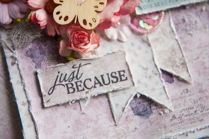
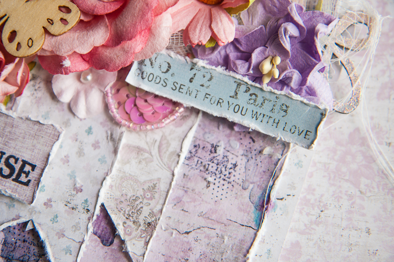
When layering my papers, I like to alternate between a neutral shade like grey, off-white or beige and what I like to call a "character color". Basically, it's the color that sets the theme and feel of the project and gives it its "character". In the case of this card, my "character color" is the soft purple with tinges of pink and it has given the card a romantic and feminine hue as it is going out to a very special lady. So following this guide, I alternated off-white with purple, and on the purple itself, varying between intricate designs like paisley swirls and simpler mini fleur di lis. The contrast between these elements lends a lot of dimension and pleasure to our eyes.
Some close-ups:
I stamped on my sentiment on a solid purple background and juxtaposed it next to the banner with more off-white so that it's obvious it's the message I want to send to my recipient. The banners were arranged to form an inverted triangle with the floral cluster, so that gives the visual flow of the card.
A little bit of the background mediums work: stenciling, painting and some stamping. I used a lace border stencil for a more feminine touch, and a little splash of blue just to create a color accent. I also placed the cut-out from the info strip diagonally across my sentiment for a smooth visual flow as that is the direction our eyes would follow when reading from one line to the next. My chipboard from Blue Fern Studios was altered with simple heat embossing using one of the fabulous EP.
Well I hope these guidelines are useful for you when thinking about creating your next project. Until then, happy crafting!
I'm on the blog today to share a layout I created with Aida's gorgeous new collection "Secret Letters". Am so loving the muted pinks and script backgrounds, and I'm sure you will have lots of fun creating with it too!
Here's my page, of my dog who has passed on 5 years ago but he lives forever in my heart:
I've used the brand new clear gesso to prime my background, but still brushed on some acrylic primer for a white-wash where my main cluster will be. My background details were created with some stenciling using Ayeeda's new design, and lots of painting with the co-ordinating Dirty Pink pastel mist, and Violet Pearl mist. Then it was loads of fun with stamping and splattering with Splash! inks,
Some close-ups:
Chipboard which I painted with Cocoa matt paint, and lots of textures created with mica flakes, microspheres and glass beads.
My flowers were a light shade of pink to begin with. As I laid them on the wet liquid acrylic medium which I used to seal the beads, the colors from the mists that ran into the liquid medium soaked into the paper flowers and coloured them at the same time.
Hello friends! Hope your weekend of trick n treat has been fun!
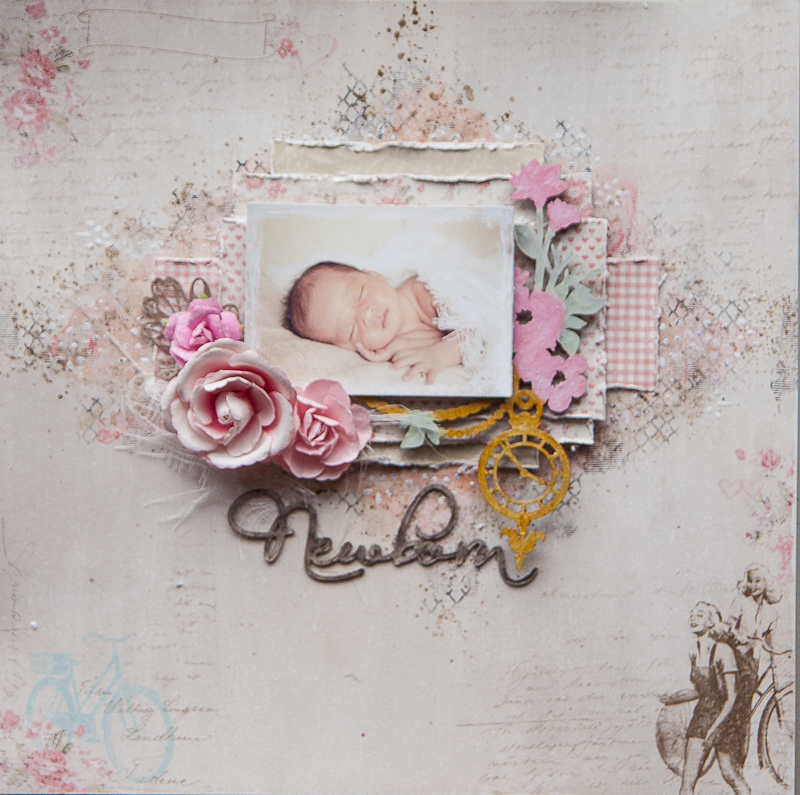
I'm up on the Blue Fern Studios blog today to share two layouts. And if you've been wondering, here are my little girl's photos at last! I finally found the time to process them and print them out for scrapping. And I got to say, the feel of a newborn in my arms and their intoxicating smell is just so addictive!
Here is my first layout, based on the November challenge sketch created by Michelle. I used lots of the gorgeous papers from the Autumn Anthology collection - pastels are really my favourite!
My take on the sketch:
This time I've pretty much stuck to the sketch changing only the title. My background is deliberately simple so as not to steal the limelight from the pretty papers and chipboards.
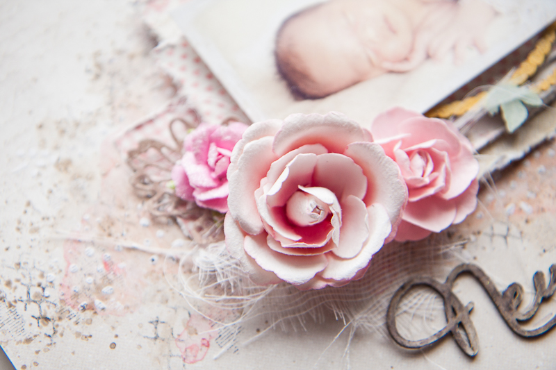
Some closeups:|
Under my flowers, I have the Floral Lattice Bits all heat-embossed and layered on top of strips of papers from the Autumn Anthology papers which I have the edges punched.
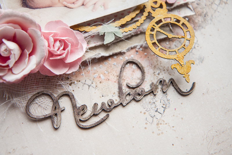
The French Ironwork chipboard which I heat-embossed as well - first with two different shades of brown and as an accent, I used the Fern Embossing Powder, one of the many new products from Blue Fern Studios. Some stamping in the background was done with the Garden Frolic stamp set.
Another half of the Floral Lattice Bit which I snipped off to balance the layout. Lots of layering too from different sheets of the collection.
My title, made up of words from two different sets - Baby Words and Perfect, Adorable, Special - which I brushed lightly with paint and inked the edges with gelato.
My next share is a video tutorial and I had heaps of fun doing it. Each and every one of my kids get a shadow box or canvas for their baby photo and my little girl is no exception. While I really love how sturdy the Blue Fern papers are, I wanted something that I could mount on a wall or display without warping over time. So I chanced upon the idea of transferring the entire sheet of patterned paper over on to my canvas.
Here is the project:
You can see just how different the background paper looks now! Because of the uneven-ness in removing the layers of paper, I had little patches of white all over, with some bits of the canvas exposed. It's a gorgeous white haze effect on top of a very pretty paper, and muted it just enough to fit the theme of the photo.
Some close-ups:
My title piece - I snipped off the "Hush" from "Hush Little Baby" to fit the composition of the canvas. I painted it with 13@rts Matt paint in Cocoa, followed by Art Anthology sorbet paint and lastly distress glitter.
Aloha Flower chippie, sneaked in between all those layers of Calling Cards cut-outs. The chippie was painted with 13@rts matt paint Peach, followed by Lilac chalk mist and Violet pearl mist.
My background is a mixture of simple stenciling as well as heat embossing with another sweet color "Petal" from Blue Fern Studios. I also cut out little butterflies and placed them all over the canvas.
Butterfly Friends chippie helping to fill out the layers and also to create visual flow.
Some of the background details.
And here is the start-to-finish video. That's all I have for you today, so sit back and enjoy!