Showing posts with label 13@rts. Show all posts

Saturday, September 3, 2016

Seaside Memories with Blue Fern Studios

Hello friends, how are you?

September is now upon us, and the weather here is becoming a little cooler with more rain. But I'm still very much in a summer mood because of the Seaside Cottages collection. Today I'm here to share two more creations with you. 


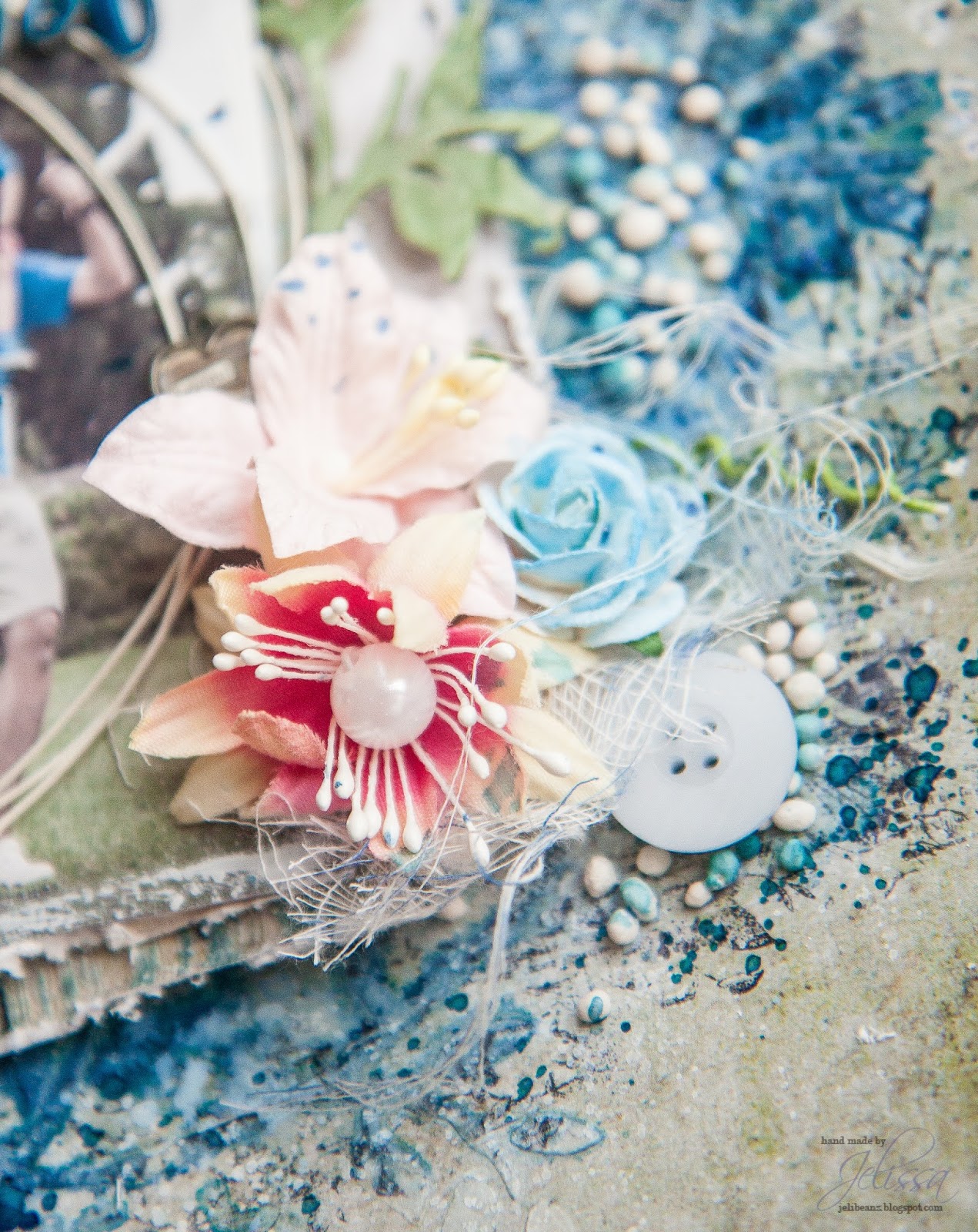
This has to be one of the simplest layout I have made in a long time with just splashes of paint in the background because the paper is too pretty to cover up. The photo is one of my boys on the day we landed in Okinawa after a really long flight. We had made our way to a sea salt factory and the view out is just amazing, with the sun starting to set.

Some details:


The Seaside Charms chipboard, which I had painted with gold acrylic paint and covered with a layer of crackle paint. 


My title piece which I had embossed with Breeze and Sky Blue embossing powders.


The top half of the Seaside Charms chipboard which I had snipped off.


My second share is another layout of my second boy when he was a baby. I love how the colors of the photo matched the background paper Embark so perfectly that I built the whole layout around this.

Details here:


Altered seashell and anchors matched with the seaside lilies.


My title piece


Fussy cut details


Mesh bits chipboard tucked behind my photo


More chipboard goodies!

And here is the start to finish video of how I put this layout together:


Thanks for dropping by! 

Wednesday, August 3, 2016

Hello friends, how have you been? 

July has been very exciting and now that August is here, I'm looking to better times ahead! Today I'm so glad to be sharing with you two creations using the fabulous new collection Seaside Cottages. This set of papers speak right to my heart and to say it was love at first sight is a great understatement. Michele has outdone herself yet again with this gorgeous beach-themed collection filled with soft colours and stunning images.


My first layout is of my eldest having some fun with his feet in the sand. Woodgrain is really my thing and I had to use it for the background. Seeing that the paper is so full of details, I toned down my background work and used to it accent the colors on the page. 

Details in the close-ups:


An anchor from part of the Seaside Flourish chippie which I had embossed with Copper EP from Imagine Ink and painted some turquoise acrylic paint over for a tarnished look. The petals were sprinkled with Dusty Pink glitter.


Layer, layer, layer! That's what you do when you have so many pretty papers at hand! Here, I built up lots of dimension with scraps from Calling Cards, Voyage and Splendour. 


Using a Calling Card sentiment as my title. The little stars on the flourish chipboard were also given a nice coat of Sunshine glitter.


My second share is a mixed media canvas and I had used so many fun stuff on it! The starfish and shells that you see are actually from a potpourri set and they smell amazing!


This is the Seashell Frame which I had a lot of fun altering with EP and duo-toned acrylic paint.


A little sailboat from Nautical Set. Check out the background - it's one of the patterned papers from Seaside collection and I didn't have to do much to make it look so grungy and vintage all at the same time!


Who doesn't love a dolphin? I have one here with some seaweed chippies. Check out the Seaside Lilies that come as part of the coordinating flowers - they are so perfectly distressed that I didn't have to fiddle with them at all. 


Mr Octopus saying hi.


I seem to have a thing for anchors again! This one is embossed and wrapped with a piece of twine.


A title piece from Calling Cards, matched by the Seaside Roses.

And here is the video of how I put everything together. Sit back and enjoy!


Thursday, June 9, 2016

Attic Charm with Blue Fern Studios

Hello friends!

Today I'm popping in to share my June creations for Blue Fern Studios, featuring another beautiful collection from Michelle Singh - Attic Charm! The papers are decked in so many gorgeous subtle details and pretty colors, not to mention reminders of the good ole days that I went to dig out old photos of my parents for the two projects I've made.

First is a layout of a photo of my folks when they were dating back in '73.


When I saw the b/w photo, I had tried to imagine what it would have looked like in color and all that came to mind was the blue sky. So I had built most of the layout around the color and chose the paper "Haberdashery" as my background paper.

More details in the close-ups:


Some bits of the Looped Frame chipboard here. I had stamped with Romantic Accents stamp and heat embossed with Imagine Ink Ebony EP before painting over with duo-toned acrylic paint.


Fussy cut flowers for layering, and subtitles from Calling Cards.


A heat-embossed image with Ebony EP using one of the Bourbon Street stamps. Love the details here!


Another view of the floral cluster.


My title piece "Always and Forever" which I had painted with Perfect Pearls.

Blue Fern Studios products used:

paper: Attic Charm - Haberdashery, Calling Cards, Generation, Mercantile, Sachet
chipboard: Looped Frames, Always and Forever
stamps: Bourbon Street, Romantic Accents
Embossing powder: Ebony

My second project is a video tutorial and I've repurposed an IKEA photo frame for the project. My parents don't have a lot of their photos on display so I hope they will find a good place to put this up.


The Dangles Border chipboard was a fun piece to use because it resembles lace. I had also die cut out a clock from the "Sachet" paper. One fabulous thing about Blue Fern's papers (and my students keep reminding me too) is that they are thicker than most other brands of patterned paper out there. This means that if you have delicate die cut designs, the paper is very unlikely to tear and can take the weight of any other mediums you might want to add.

Other details in the close-ups:


Attic Charm daisies are the perfect addition.


Layering Stems - one of my favourites! Seen together with Attic Charm daisies and glitter roses.


The die cut clock with lots of details in the background.


Altered Dangles Border with a bit of sparkle.


Lots of fussy cut details again.

And here is the start to finish video for this project. Sit back and enjoy!


Blue Fern Studios products used:

paper: Attic Charm - Generation, Sachet, Calling Cards, Attire
chipboard: Dangles Border, Layering Stems
Stamps: Romantic Accents set
Embossing powder: 14 Karat, Clover, Verdant


Tuesday, May 3, 2016

Tranquility with Blue Fern Studios

Hello Blue Fern friends!


I'm up on the blog today to share with you my creations for May. I had other projects planned for this post but this collection was too beautiful for me to put down. As usual, I like to play with light and dark background papers and this post is no different.

For my first project, I based it on the May sketch challenge although it didn't make it in time for the sketch reveal a few days ago. Below is the sketch again:


I just had to make a big deal of the blues here because of the boys' t-shirts. It also matches the color scheme of the paper perfectly. Lots of subtle details in the background as I wanted it to merge with the paper itself.

Some details in the close-ups:


Tranquillity flowers. I'm so glad BFS has released coordinating flower packs! No more hunting high and low for blooms that match. 


Altering one of the roses a bit with some watercolor paint to create an ombre effect.


A chippie which I altered by first painting with green watercolor, followed by layering the embossing powders Lilac, Amethyst and with a sprinkle of glitter in Sunshine. 


For my title piece "Blissful", I layered the embossing powders In The Navy, Seven Seas, Cerulean and Breeze.


My second share is a video tutorial, of a layout of the boys at Rockingham Beach. Granted it was close to winter and chilly, we were hoping to make a day trip to Penguin Island just across the shore and check out the wildlife. Unfortunately the ferry trips were all canceled but we had a lot of fun picking up shells and watching the sea birds play in the distance. 


I love how the whole project turned out, although there were a few bits which I thought I could have added more details - some of you may know what I'm talking about when I say I wanted to do something this minute and the next minute I've clean forgotten it! Nevertheless, I'm a sucker for woodgrain patterns and this sheet of Calm (I've used the reverse side for the first layout, that's how much I like it) really got my groove going. 

Some details in the close-ups:


A cute little anchor amidst the waves. Matched with Tranquility flowers. 


More altered blooms, shells and seaweed chippies.


Love how the glitter sparkles in the sunlight, much like seaspray on a summer day.


Lapping waves and foam


The title piece - Fascination. Love the duo-toned effect in the sun!

And here is the start to finish video tutorial. I have noted the feedback from the previous video and slowed things down here so that you don't miss out on the action. Sit back and have fun!


love,
Jelissa


Tuesday, February 23, 2016

Saying Goodbye

Hello friends,

how has everyone been? Today will be my last project for 13@rts after 2 wonderful terms with Aida and the best team in the world. It is after a lot of consideration that I have to say goodbye, as you all know we have a new addition to the family and it is getting more difficult to find time for myself and for creating. All the mothers out there will know - it is almost impossible to go to the toilet some times! Hopefully things will get easier as the kids grow up and I can start creating again.

For my last post, I am sharing a project of my little girl. She has the sweetest smile that makes us unable to get angry with her when she is naughty. Yes, at 5 months old she is already up to a lot of mischief just like her two brothers.


I started with a white cardstock and primed it with 13@rts clear gesso before working on my background. Lots of layering of mediums - I first created an array of stenciled doily with a paste of Pink metallic paint and Magic powder. I then sprayed water generously to get the pink from the paste to bleed out. When this is dry, I painted on more colors with Pink pearl mist and Raspberry matt paint. After all the colors have dried, I stenciled more words with modeling paste and painted on a final layer with Chalk Dirty Pink. Lastly, this was finished with stamping to create motion on the page.

More details in the close-ups:


Straws that I made with Olga's Starlight collection papers. I brushed one end into gel medium and dipped it into gold stripes to create confetti. The Wheelies and Buttons chipboard was painted with Coral and Apricot matt paints. I had also sprinkled some gold microspheres here and there.


Left-over from one of the store's flower packs which I had torn off the centre for another project. This is perfect for staging my butterfly cut out from Secret Letters and I had painted lightly with Pearl Pink mist. I also built my paper layers from Starlight collection.


More background goodies here.


My balancing cluster create with some flowers and a cut-out butterfly from Secret Letters.


Chipboard title from 13@rts that I had left unaltered.


Hidden sentiments in the background.

That's all I have for today. I will miss all the wonderful people on the 13@rts team. Hope to see everyone again!
love,