Wednesday, August 3, 2016

Hello friends, how have you been? 

July has been very exciting and now that August is here, I'm looking to better times ahead! Today I'm so glad to be sharing with you two creations using the fabulous new collection Seaside Cottages. This set of papers speak right to my heart and to say it was love at first sight is a great understatement. Michele has outdone herself yet again with this gorgeous beach-themed collection filled with soft colours and stunning images.


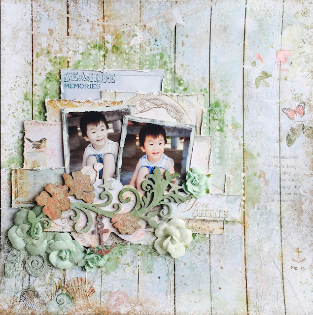
My first layout is of my eldest having some fun with his feet in the sand. Woodgrain is really my thing and I had to use it for the background. Seeing that the paper is so full of details, I toned down my background work and used to it accent the colors on the page. 

Details in the close-ups:


An anchor from part of the Seaside Flourish chippie which I had embossed with Copper EP from Imagine Ink and painted some turquoise acrylic paint over for a tarnished look. The petals were sprinkled with Dusty Pink glitter.


Layer, layer, layer! That's what you do when you have so many pretty papers at hand! Here, I built up lots of dimension with scraps from Calling Cards, Voyage and Splendour. 


Using a Calling Card sentiment as my title. The little stars on the flourish chipboard were also given a nice coat of Sunshine glitter.


My second share is a mixed media canvas and I had used so many fun stuff on it! The starfish and shells that you see are actually from a potpourri set and they smell amazing!


This is the Seashell Frame which I had a lot of fun altering with EP and duo-toned acrylic paint.


A little sailboat from Nautical Set. Check out the background - it's one of the patterned papers from Seaside collection and I didn't have to do much to make it look so grungy and vintage all at the same time!


Who doesn't love a dolphin? I have one here with some seaweed chippies. Check out the Seaside Lilies that come as part of the coordinating flowers - they are so perfectly distressed that I didn't have to fiddle with them at all. 


Mr Octopus saying hi.


I seem to have a thing for anchors again! This one is embossed and wrapped with a piece of twine.


A title piece from Calling Cards, matched by the Seaside Roses.

And here is the video of how I put everything together. Sit back and enjoy!


Monday, August 1, 2016

Simply Wonderful with Made With Love


Hello friends!

I'm so glad to be back on the Made With Love team for another year and today I'll be sharing a very simple layout created with lots of goodies you can find at the Made With Love store at 313 Somerset. This page was a really quick one because it was easy to see from the papers in my DT kit, just how I wanted it to be.


I had the gorgeous floral papers from Kaisercraft's Mademoiselle collection, as well as a lovely piece from Prima's Maestro collection that I had used for my background. This was looking like a very light and bright piece dominated by the fussy cut flowers that I had to go easy on the background work. Sometimes people ask me how do I know how I want my mixed media background to look like and what kind of papers to go along with? Most times, it's looking at what you have on hand, deciding on which are the elements that you want to bring out, what products you want to highlight and put the emphasis on those when you create.  The papers I had here were earthy tones with many beautiful details, so it would be a waste to cover them up with too much paint and mediums. In this case, the background really serves as a background - to complement the fussy-cut roses and the chipboards that I wanted to showcase some altering techniques with.

Some details in the close-ups:


Lovely flowers from Prima Marketing that I had altered by first painting with Kaisercraft's acrylic paint in Burgundy and Pink, then dusting some glitter on the stamens. You can also see bits of stenciled details with butterflies in the background - this is done with TCW's butterfly grid stencil. The sentiment was cut out from the info strip from one of the patterned papers.


Postage stamp chipboards from Blue Fern Studios, which I had heat embossed with Tarnished Gold EP, distressed the edges with Walnut Stain and then brushed on a coat of High Impact White Metallic paint from Tattered Angels. This photo doesn't do the shine much justice, but it looks just fabulous IRL!


More of the background details and strips of torn paper I had used to layer up the page.


Title piece made up of a word from Heidi Swapp and a bit from Kaisercraft's be-YOU-ti-ful collection.

That's all I have for today, thanks for dropping by!

Supplies used (available from Made With Love):

Distress Ink: Rangers (Walnut Stain)
Paint: Tattered Angels (High Impact Metallics), Kaisercraft acrylic paint (Burgundy, Pink)
Embossing powder: Rangers (Tarnished Gold)
Papers: Kaisercraft (Mademoiselle), Prima Marketing (Maestro)
Flowers: Prima Marketing
Stencil: The Crafters Workshop
Wooden word title: Heidi Swapp